It's time for another Color Throwdown! Wanda is our hostess this week and she's sharing a soft, muted color palette this week--pale mint green, saffron yellow, and ivory.
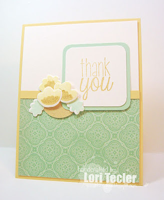
 I combined the colors with elements from the current inspiration photo and the sketch from Fusion. After searching through my stash for some soft mint paper, I found some in an older patterned paper pack. I covered the bottom of a cream panel with a piece of the patterned paper, using a narrow saffron strip to hide the seam between the two panels. The panel was adhered to a matching saffron card base. The "thank you" sentiment from Avery Elle's Many Thanks set was stamped in gold ink on a cream square with rounded edges. I matted it with a mint panel, then adhered it to the cardfront.
 I stamped up a trio of flowers using Avery Elle's Fabulous Florals set. The flowers were stamped in a soft yellow pigment ink, then accented with a bit of sparkly gold. I arranged the flowers and the mint leaves over a gold circle at the edge of the sentiment panel.
To play along, just create a paper crafted project using these colors as a starting point and add a direct link to your finished project using the linky tool found at the end of this week's CTD post. As always, if you don’t have exact color matches, something close works just fine. Just be sure that the challenge colors are the dominant ones in your project. And, if you upload your project to an online gallery, use the keyword CTD363. If you upload your projects on social media, go ahead and use the hashtag #ctd363 and #colorthrowdown. You can find us on Instagram (and on Facebook!) with the username colorthrowdown.
Before you get started, here’s some inspiration from the talented Color Throwdown team, our October guestie Michelle Boyer, and this week’s guest star stamper, Christine Dring.

Materials Used:
Fabulous Florals and Many Thanks stamp sets, Mint to Be ink, Fabulous Florals dies (Avery Elle); Delicata Golden Glitz ink (Tsukineko/IMAGINE Crafts); Lemon Chiffon pigment ink, Spearmint cardstock (My Favorite Things); So Saffron cardstock (Stampin' Up!); gold paper (Target); Vintage Vogue 6x6 paper pad (Pink Paislee); circle punch (EK Success); corner rounder; foam tape


So soft, Lori! I like the dimension of the flower and pretty background stamp on the bottom panel. It's fun to see so many different interpretations of the color palette. :)
ReplyDeleteWhat a beautiful card! I love what you did with the color combo and the sketch!
ReplyDeleteSuper sweet card, Lori and perfect use of the colors!
ReplyDeleteLove your patterned paper...such a beautiful card for both challenges!
ReplyDeleteVery pretty!
ReplyDeleteSo pretty with those sweet little flowers and the mint patterned paper....I looked for an hour for some mint paper without any luck!!! Great take on the sketch, too!!!
ReplyDeleteBeautiful soft card and those flowers are so sweet! You've used the colors perfectly! Thanks so much for joining us at Fusion Card Challenge.
ReplyDeleteLove your take on the color challenge! Score on that minty patterned paper, because it looks fabulous on your awesome card!
ReplyDeleteSuch beautiful colors! And you have showcased them so well!! I love your little flower arrangement, it looks like a flower basket to me...so pretty! Thanks for playing along with the Fusion Card Challenge!
ReplyDeletelovely soft colors Lori! Thanks for playing at Fusion!
ReplyDelete