Showing posts with label SugarPea Designs. Show all posts

Wednesday, July 16, 2025

Color Throwdown 837-Just a Note

It's time for another Color Throwdown! It's my turn to be challenge hostess this week and my color trio--yellow, pink, and grey--is inspired by a trio of crochet pencils. I'm learning to crochet and hoping that I might actually be close to having the skills to make myself one of these...

Just a Note card-designed by Lori Tecler/Inking Aloud-stamps and dies from SugarPea Designs
I couldn't resist going with a pencil theme for my card, too. My pencil was made by using Copic markers to add color to a pencil shape I made with a die from SugarPea Designs. I used foam tape to attach the pencil to a stitched circle panel found in my scrap pile, then added it to a white panel over the right side of yellow cardstock strip. To bring in a bit more yellow, I used another die from the same set to make a piece of notebook style paper to tuck beneath the round panel. And, using yet another die from the set, I made a paper clip from a gray cardstock scrap. After knotting a pink ribbon scrap to the top of the clip, I clipped it on to the round panel. For the sentiment, I die cut the word "note" from gray cardstock and glued the letters to the yellow cardstock strip. The "just a" sentiment from SPD's Special Delivery stamp set was stamped above the die cut word in gray ink. I adhered the panel to a pink card base matching the round panel to finish the design.


To play along, just create a paper crafted project using these colors as a starting point and add a direct link to your finished project using the linky tool found at the end of this week's CTD post. As always, if you don’t have exact color matches, something close works just fine. Just be sure that the challenge colors are the dominant ones in your project. And, if you upload your project to an online gallery, use the keyword CTD837. If you upload your projects on social media, go ahead and use the hashtag #ctd837 and #colorthrowdown.  You can find us on Instagram and on Facebook with the username colorthrowdown.  Before you get started, here’s some inspiration from the talented Color Throwdown team. 

** Amy ** Kelly **
  ** Lisa ** Lynn **
** Susie **  Vickie ** Wanda **
** Featured Stamper Renate **

Materials Used:
Special Delivery stamp set, Norebook Journal Card dies (SugarPea Designs); Memento Gray Flannel ink (Tsukineko/IMAGINE Crafts); markers (Copic); Lovely Lady and Lemon Tart cardstock (Papertrey Ink); foam tape

Wednesday, November 20, 2024

Color Throwdown 820-Thanks a Latte


It's time for another Color Throwdown! Wanda is our hostess this week with a warm, rustic color mix--amber, rust, and kraft.

Thanks a Latte card-designed by Lori Tecler/Inking Aloud-stamps and dies from SugarPea Designs
I used the colors and the current sketch from Sunday Stamps for a coffee themd thank you card. My focal image is a to go cup created with dies from SugarPea Designs. I used foam tape to adhere the cup to an amber panel with a strip of rust cardstock along the left side. The rust section is edged with a super narrow strip of kraft cardstock that sets the panel off from the rust card base that I adhered the amber panel to. I die cut the word "latte" from kraft cardstock using another SPD die. After placing narrow strips of foam tape on the back of the word, I arranged it on the cardfront, slightly overlapping the to go cup. The "thanks a" sentiment from the Brew-tiful Sentiments set was stamped on a narrow rust cardstock strip using dark brown ink. I placed it on the cardfront, tucking the left edge of the strip under the raised cup and the panel beneath the top letters in the die cut word. A trio of dark brown enamel dots arranged on the left side of the to go cup complete the design.

To play along, just create a paper crafted project using these colors as a starting point and add a direct link to your finished project using the linky tool found at the end of this week's CTD post.  As always, if you don’t have exact color matches, something close works just fine. Just be sure that the challenge colors are the dominant ones in your project. And, if you upload your project to an online gallery, use the keyword CTD820. If you upload your projects on social media, go ahead and use the hashtag #ctd820 and #colorthrowdown.  You can find us on Instagram and on Facebook with the username colorthrowdown.  Before you get started, here’s some inspiration from the talented Color Throwdown team.

** Amy Rohl **  Broni ** Tammy **
** Kelly ** Lisa ** Lynn **
** Susie **  Vickie ** Wanda **
** Guest Star Stamper Michele Ferguson **

Materials Used:
Brew-tiful Sentiments stamp set, Coffee To Go Cup and Coffee Words dies (SugarPea Designs); Memento Espresso Truffle ink (Tsukineko/IMAGINE Crafts); Really Rust cardstock (Stampin' Up!); Harvest Gold and Kraft cardstock (Papertrey Ink); enamel dots (Doodlebug Design);foam tape

Wednesday, October 16, 2024

Color Throwdown 815-Thankful for a Friend Like You


It's time for another Color Throwdown! Susie is our hostess this week with a great mix of colors--aqua, orange, and green.

Thankful for a Friend Like You card-designed by Lori Tecler/Inking Aloud-stamps and dies from SugarPea Designs
Here's my take on the challenge colors using the layout from TGIF Challenges. I built my design on an aqua card base. I cut three cream panels and matted each on olive green cardstock before placing them vertically along the right side of the cardfront. The top and bottom panel are filled with leaf die cuts created with the Stitched Autumn Icons dies from SugarPea Designs. The middle panel has a pair of stitched pumpkins cut with the same dies. For interest I adhered them with foam tape to add dimension. I stamped "thankful for a friend like you" in orange ink on a cream panel, then matted it on olive cardstock before positioning it on the cardfront overlapping the pumpkin pair.

To play along, just create a paper crafted project using these colors as a starting point and add a direct link to your finished project using the linky tool found at the end of this week's CTD post.  As always, if you don’t have exact color matches, something close works just fine. Just be sure that the challenge colors are the dominant ones in your project. And, if you upload your project to an online gallery, use the keyword CTD815. If you upload your projects on social media, go ahead and use the hashtag #ctd815 and #colorthrowdown.  You can find us on Instagram and on Facebook with the username colorthrowdown.  Before you get started, here’s some inspiration from the talented Color Throwdown team.

** Amy Rohl **  Broni **
** Kelly ** Lisa ** Lynn **
** Susie **  Vickie ** Wanda **
** Guest Star Stamper Jerralyn Rose **

Materials Used:
Nuts About You stamp set, Stitched Autumn Icons dies (SugarPea Designs); Memento Tangelo ink (Tsukineko/IMAGINE Crafts); Old Olive and Pumpkin Pie cardstock (Stampin' Up!); Kraft cardstock (Papertrey Ink); aqua cardstock (Recollections); foam tape

Wednesday, July 10, 2024

Color Throwdown 801-Thanks a Latte

It's time for another Color Throwdown! Amy Rysavy is our challenge hostess this week with a great mix of colors--navy, terracotta, and kraft.

Thanks a Latte card-designed by Lori Tecler/Inking Aloud-stamps and dies from SugarPea Designs
I paired the challenge colors with the current sketch at Try Stampin' on Tuesday for this coffee themed design. My focal image is a to-go coffee cup made with dies from SugarPea Designs. I used foam tape to adhere the assembled die cut pieces to the left side of a navy cardstock strip. The "thanks a latte" sentiment fills the right side of the strip. For interest, I heat embossed the "thanks a" from SPD's Brew-tiful Sentiments set in white, then added the die cut "latte" beneath it. The kraft card base was stamped with a coffee ring image from the same sentiment set. The terracotta ink I used looks a lot like coffee! I adhered the navy strip to the card base to finish the design.

To play along, just create a paper crafted project using these colors as a starting point and add a direct link to your finished project using the linky tool found at the end of this week's CTD post.  As always, if you don’t have exact color matches, something close works just fine. Just be sure that the challenge colors are the dominant ones in your project. And, if you upload your project to an online gallery, use the keyword CTD801. If you upload your projects on social media, go ahead and use the hashtag #ctd801 and #colorthrowdown.  You can find us on Instagram and on Facebook with the username colorthrowdown.  Before you get started, here’s some inspiration from the talented Color Throwdown team.

** Amy Rohl **  Amy Rysavy ** Broni **
** Kelly ** Lisa ** Lynn **
** Susie **  Vickie ** Wanda **
** Guest Star Stamper Tanya Harvey **

Materials Used:
Brew-tiful Sentiments stamp set, Coffee Words and Coffee to Go Cup dies (SugarPea Designs); Memento Potter's Clay and Memento Luxe Wedding Dress inks (Tsukineko/IMAGINE Crafts); Kraft and Canyon Clay cardstock (Papertrey Ink); Navy cardstock, Snow embossing powder (Recollections); foam tape

Wednesday, May 8, 2024

Color Throwdown 792-Thanks a Latte


It's time for another Color Throwdown! Kelly is our hostess this week with a pretty mix of colors--blue, kraft, and cream.

Thanks a Latte card-designed by Lori Tecler/Inking Aloud-stamps and dies from SugarPea Designs
I paired the colors with the current challenge at Sunday Stamps. My focal image is a die cut to go coffee cup cut from cream and kraft cardstock using dies from SugarPea Designs. I arranged the pieces on a kraft panel using foam tape for dimension. I angled the panel before setting it over a cream panel centered on a blue card base. Now that I look at it again, I probably should have cut the kraft panel with some type of stitched or dotted die to add interest... I tucked a layered fishtail flag strip made from blue and kraft die cut pieces between the kraft and cream panels, then added the "thanks a latte" sentiment from the SPD Espresso Your self stamp set to the lower right corner of the kraft panel to finish the card.

To play along, just create a paper crafted project using these colors as a starting point and add a direct link to your finished project using the linky tool found at the end of this week's CTD post.  As always, if you don’t have exact color matches, something close works just fine. Just be sure that the challenge colors are the dominant ones in your project. And, if you upload your project to an online gallery, use the keyword CTD792. If you upload your projects on social media, go ahead and use the hashtag #ctd792 and #colorthrowdown.  You can find us on Instagram and on Facebook with the username colorthrowdown.  Before you get started, here’s some inspiration from the talented Color Throwdown team.

** Amy Rohl **  Amy Rysavy ** Broni **
** Kelly ** Lisa ** Lynn **
** Susie **  Vickie ** Wanda **
** Guest Star Stamper Celeste Goff **

Materials Used:
Espresso Yourself stamp set, Coffee to Go Cup dies (SugarPea Designs); Memento Rich Cocoa ink (Tsukineko/IMAGINE Crafts); Brocade Blue cardstock (Stampin' Up!); Kraft cardstock (Papertrey Ink); circle dies (Spellbinders); Fishtail Flag STAX dies (My Favorite Things); foam tape

Wednesday, February 14, 2024

Color Throwdown 780-Sending Love

It's time for another Color Throwdown! Wanda is our hostess today with a classic Valentine's Day color combination--red, kraft, and white. 

Sending Love card-designed by Lori Tecler/Inking Aloud-stamps from Reverse Confetti
I did just a tiny bit of stamping here, relying on a large die cut word to do most of the work for me. My focal image is the layered die cut word "love" made with a die from Reverse Confetti. To add interest, I used foam tape to pop up the heart that stands in for the "o." The word was placed directly on a kraft card base. I stamped the word "sending" from RC's Sending Smiles just above the die cut in black ink. I accented the word with a small die cut envelope and a red heart die cut.

To play along, just create a paper crafted project using these colors as a starting point and add a direct link to your finished project using the linky tool found at the end of this week's CTD post.  As always, if you don’t have exact color matches, something close works just fine. Just be sure that the challenge colors are the dominant ones in your project.  And, if you upload your project to an online gallery, use the keyword CTD780.  If you upload your projects on social media, go ahead and use the hashtag #ctd780 and #colorthrowdown.  You can find us on Instagram and on Facebook with the username colorthrowdown.  Before you get started, here’s some inspiration from the talented Color Throwdown team.

** Amy Rohl **  Amy Rysavy ** Broni **
** Kelly ** Lisa ** Lynn **
** Susie **  Vickie ** Wanda **
** Guest Star Stamper Nancy Elrick **

Materials Used:
Sending Smiles stamp set, Big Love and Love Note dies (Reverse Confetti); Memento Tuxedo Black ink (Tsukineko/IMAGINE Crafts); Kraft cardstock (Papertrey Ink); red cardstock (Recollections);Special Delivery Accents dies (SugarPea Designs); foam tape

Wednesday, October 25, 2023

Color Throwdown 766-Eek-a-Boo!

It's time for another Color Throwdown! Lisa is our hostess this week with a mix of complementary colors--orange, pale blue, and cream.

Eek-a-Boo card-designed by Lori Tecler/Inking Aloud-stamps from SugarPea Designs
I paired the colors with the current sketch at Sunday Stamps and a fun Halloween themed stamp set from SugarPea Designs. For the focal image, I stamped the ghost image from the Eek-a-Boo! stamp set on white vellum and heat embossed it with cream embossing powder. I carefully cut out the embossed image by hand, then added just a bit of color to the back of the ghost. For the background, I stamped a pair of spiderwebs on the sides of a light blue cardstock panel and embossed them with cream embossing powder, leaving an open space in the center for the ghost image. I matted the panel on cream cardstock and adhered it to the center of an orange cardfront. The set's "eek-a-boo" sentiment was stamped in orange ink on a cream panel, then adhered to the right side of the image panel.

To play along, just create a paper crafted project using these colors as a starting point and add a direct link to your finished project using the linky tool found at the end of this week's CTD post.  As always, if you don’t have exact color matches, something close works just fine. Just be sure that the challenge colors are the dominant ones in your project.  And, if you upload your project to an online gallery, use the keyword CTD766.  If you upload your projects on social media, go ahead and use the hashtag #ctd766 and #colorthrowdown.  You can find us on Instagram and on Facebook with the username colorthrowdown.  Before you get started, here’s some inspiration from the talented Color Throwdown team.

** Amy Rohl **  Amy Rysavy ** Broni **
** Kelly ** Lisa ** Lynn **
** Susie **  Vickie ** Wanda **
** Guest Star Stamper Liz Williams **

Materials Used:
Eek-a-Boo! stamp set (SugarPea Designs); Memento Tangelo and Versamark inks (Tsukineko/IMAGINE Crafts); markers (Copic); Pumpkin Pie, Soft Sky, and Very Vanilla cardstock, Vanilla embossing powder (Stampin' Up!); white vellum (Recollections)

Wednesday, November 23, 2022

Color Throwdown 720-Wishing You Peace and Joy

It's time for another Color Throwdown! Wanda is our hostess this week with an earthy mix of colors--sage green, black, kraft, and copper.

Wishing You Peace and Joy card-designed by Lori Tecler/Inking Aloud-stamps and dies from SugarPea Designs
I used the colors to create a simple holiday card with a leafy green wreath as the focal image. My wreath is from the SugarPea Designs Funky Wreaths--All Season stamp set. I stamped the image in sage green ink on cream cardstock and cut it out with the matching die, then used foam tape to adhere it to a wide panel of brushed copper cardstock. After edging the copper panel with black strips, I placed it on a kraft card base. The "wishing you peace and joy" sentiment from SPD's Flurry of Warm Wishes stamp set was stamped just beneath the copper panel in sage green ink. A teeny, tiny bow made for the wreath from a scrap of black gingham ribbon was the one embellishment I added to the simple design.

To play along, just create a paper crafted project using these colors as a starting point and add a direct link to your finished project using the linky tool found at the end of this week's CTD post.  As always, if you don’t have exact color matches, something close works just fine.  Just be sure that the challenge colors are the dominant ones in your project.  And, if you upload your project to an online gallery, use the keyword CTD720.  If you upload your projects on social media, go ahead and use the hashtag #ctd720 and #colorthrowdown.  You can find us on Instagram and on Facebook with the username colorthrowdown.  Before you get started, here’s some inspiration from the talented Color Throwdown team and this week's Guest Star Stamper.

** Amy Rohl **  Amy Rysavy ** Barbara **
** Broni ** Lisa ** Lynn **
** Susie **  Vickie ** Wanda **
** Guest Star Stamper Alisa Steinlicht **

Materials Used:
Funky Wreaths--All Season and Flurry of Warm Wishes stamp sets, Funky Wreaths--All Season dies (SugarPea Designs); Memento Pistachio ink (Tsukineko/IMAGINE Crafts); Basic Black and Brushed Copper cardstock (Stampin' Up!); Kraft cardstock (Papertrey Ink); black gingham ribbon; foam tape

Sunday, January 16, 2022

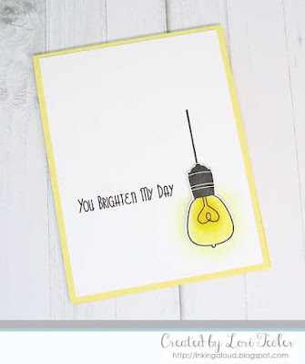
You Brighten My Day

You Brighten My Day card-designed by Lori Tecler/Inking Aloud-stamps from SugarPea Designs
With the combination of a long weekend and wintery weather, I was able to get in some stamping time! I went back to my clean and simple roots for this design based on the current challenge at Freshly Made Sketches. The layout's round element is represented by the largest bulb from the SugarPea Designs Watt's Up? stamp set. The image was colored with Copic markers, then cut out by hand. It's hard to see in the photo, but I added a light coating of shimmery clear glitter to the bulb to help it to shine. The image was adhered to the panel using foam tape for dimension. I stamped the "you brighten my day" sentiment to the left of the raised bulb. The panel was adhered to a lemon yellow cardfront to coordinate with the glowing bulb.

Materials Used:
Watt's Up? stamp set (SugarPea Designs); Memento Tuxedo Black ink (Tsukineko/IMAGINE Crafts); markers (Copic); Lemon Tart cardstock (Papertrey Ink); clear Sparkle glitter brush pen (Spectrum Noir); foam tape

Sunday, January 9, 2022

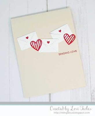
Sending Love

Sending Love card-designed by Lori Tecler/Inking Aloud-stamps and dies from SugarPea Designs

Here's my card for the current sketch at Freshly Made Sketches. I represented the layout's five elements with a mix of die cut mini envelopes and hearts. After settling on an arrangement I liked, I used a piece of Press 'n Seal to lift the elements off of my very pale pink cardfront so I could maintain the placement of the die cuts while adding adhesive to the backs. Once I had adhesive on the pieces, I put them back on the cardfront by flipping the Press 'n Seal sheet back over again and releasing the die cut pieces after pressing them down on to the cardfront. The "sending love" sentiment from the SugarPea Designs Everyday Sentiments stamp set was stamped at the right side of the cardfront, just underneath the line of images. I used red ink and my MISTI, which let me double stamp the image for a crisp, bold imprint.

Materials Used:
Everyday Sentiment stamp set, Special Delivery Accents and Heart Journal Card dies (SugarPea Designs); Memento Love Letter ink (Tsukinekp/IMAGINE Crafts); Red Punch and Rose Petals cardstock (Recollections)

Wednesday, October 20, 2021

Color Throwdown 665-Spooktacular Halloween

It's time for another Color Throwdown! Susie is our hostess this week with a mix of colors inspired by a platter of Halloween treats in a non-traditional color scheme--pink, lavender, and aqua.

Wishing You A Spooktacular Halloween card-designed by Lori Tecler/Inking Aloud-stamps and dies from SugarPea Designs
After seeing the inspiration for the color scheme, I couldn't resist going with a ghost theme for my card, especially since this may be the only Halloween card I make this year! My ghost is from the Eek-a-Boo set from SugarPea Designs. I colored the image with Copic markers before cutting the image out by hand. I used foam tape to adhere the image to a die cut star filled lavender panel. The panel was adhered to an aqua card base, filling in the negative space in the star panel. For the sentiment, I stamped the set's "wishing you a spooktacular Halloween" sentiment on a trio of cardstock strips. The strips were arranged on the left side of the die cut panel using foam tape for dimension. 

To play along, just create a paper crafted project using these colors as a starting point and add a direct link to your finished project using the linky tool found at the end of this week's CTD post.  As always, if you don’t have exact color matches, something close works just fine.  Just be sure that the challenge colors are the dominant ones in your project.  And, if you upload your project to an online gallery, use the keyword CTD665If you upload your projects on social media, go ahead and use the hashtag #ctd665 and #colorthrowdown.  You can find us on Instagram and on Facebook with the username colorthrowdown.  Before you get started, here’s some inspiration from the talented Color Throwdown team.

** Amy Rohl **  Amy Rysavy ** Barbara ** 
** Broni ** Lisa ** Lynn **
** Susie **  Vickie ** Wanda **

Materials Used:
Eek-a-Boo stamp set (SugarPea Designs); Memento Tuxedo Black ink (Tsukineko/IMAGINE Crafts); markers (Copic); Lovely Lady cardstock (Papertrey Ink); Sno Cone cardstock (My Favorite Things); Very Violet cardstock (Recollections); foam tape

Wednesday, October 13, 2021

Color Throwdown 664-Sending Bear Hugs


It's time for another Color Throwdown!  Amy Rohl is our hostess this week with a great color combination--turquoise, kraft, brown, and white.

Sending Bear Hugs card-designed by Lori Tecler/Inking Aloud-stamps and dies from SugarPea Designs
I paired the colors with the cuddly bear from the SugarPea Designs Hey Winter stamp set. The hat was stamped first, the masked so that it sat on the bear's head. I used Copic markers to color in the image, then dabbed the bear's fur with a rag dipped in colorless blender for a textured look. For more texture, I added white flock to the pom poms on the bear's hat. After cutting out the colored image, I used foam tape to adhere the image to a turquoise zig zag stitched circle die cut. The circle was adhered to the left side of a kraft card base, then trimmed along the edge to align with the side of the cardfront. For contrast, I placed a smaller dark brown zig zag stitched circle die cut beneath the lower right side of the round panel. The set's "sending bear hugs" sentiment was stamped in turquoise ink at the end of a white fishtail flag panel. To "stretch" the sentiment strip, I strategically cut it into two pieces and tucked them beneath the raised bear image. The strip was accented with a trio of turquoise enamel dots to bring in one more round element.

To play along, just create a paper crafted project using these colors as a starting point and add a direct link to your finished project using the linky tool found at the end of this week's CTD post.  As always, if you don’t have exact color matches, something close works just fine.  Just be sure that the challenge colors are the dominant ones in your project.  And, if you upload your project to an online gallery, use the keyword CTD664If you upload your projects on social media, go ahead and use the hashtag #ctd664 and #colorthrowdown.  You can find us on Instagram and on Facebook with the username colorthrowdown.  Before you get started, here’s some inspiration from the talented Color Throwdown team and our Guest Star Stamper Betty Wright.

** Amy Rohl **  Amy Rysavy ** Barbara ** 
** Broni ** Lisa ** Lynn **
** Susie **  Vickie ** Wanda **
** Guest Star Stamper Betty Wright **

Materials Used:
Hey Winter stamp set, Zig Zag Stitched Circle dies (SugarPea Designs); Memento Tuxedo Black and Teal Zeal inks (Tsukineko/IMAGINE Crafts); markers (Copic); Bermuda Bay and Chocolate Chip cardstock (Stampin' Up!); Kraft cardstock (Papertrey Ink); teal enamel dots (Eyelet Outlet); white flock (Stampendous); foam tape


Thursday, August 19, 2021

Thankful for You

Thankful for You card-designed by Lori Tecler/Inking Aloud-stamps and dies from SugarPea Designs
Here's my card for the current Mix it Up challenge at SugarPea Designs. I paired the layout with elements from the inspiration photo (color scheme, fall theme) for this sweet card.

My focal image is the cutie from SPD's Bountiful Blessings stamp set. The image was colored with Copic markers, then cut out with my Scan 'n Cut machine. I used foam tape to place the image on a dark brown Zig Zag Stitched Circles die cut. The die cut was adhered to the left side of a red card base over a pair of gold foil cardstock strips. The set's "thankful for you" stamp was curved on my clear block to match the shape of the circle, then stamped just outside the lower right edge of the circle to finish the design.

Materials Used:
Bountiful Blessings stamp set, Zig Zag Stitched Circles dies (SugarPea Designs); Memento Tuxedo Black ink (Tsukineko/IMAGINE Crafts); markers (Copic); Riding Hood Red and Chocolate Chip cardstock (Stampin' Up!); Gold Foil cardstock (Recollections); foam tape

Thursday, July 29, 2021

You Brighten My Day

You Brighten My Day card-designed by Lori Tecler/Inking Aloud-stamps from SugarPea Designs
Here's my card for the current challenge at The Paper Players. I used the layout for this cheery design made with stamps from SugarPea Designs. I stamped a pair of light bulbs from SPD's Watt's Up? stamp set for my focal image. The bulbs were colored with Copic markers in bold shades of yellow. I left room at the bottom of the panel to stamp the "you brighten my day" sentiment. The image panel was matted on black cardstock, then adhered to a gray striped patterned paper panel over a trio of bright yellow cardstock strips. I matted the patterned paper panel on black cardstock before adhering it to a yellow card base to finish the design.

Materials Used:
Watt's Up? stamp set (My Favorite Things); Memento Tuxedo Black ink (Tsukineko/IMAGINE Crafts); markers (Copic); Bright Buttercup cardstock, Soft Stone patterned paper (Papertrey Ink); Basic Black cardstock (Stampin' Up!)

Thursday, July 22, 2021

Dude

Hi There, Dude card-designed by Lori Tecler/Inking Aloud-stamps from SugarPea Designs

Here's my card for this month's Mix It Up challenge at SugarPea Designs. I paired the sketch with elements from the inspiration photo (color scheme, beachy theme) for this fun design featuring SPD's Hey Summer stamp set.

I colored the set's bear, board, and ball images with Copic markers, then used my Scan 'n Cut machine to cut out the colored piece. They were arranged on a panel of cloud patterned paper from a SPD paper pad. I matted the patterned panel on contrasting blue cardstock before adhering it to a blue card base that coordinates with the patterned paper panel. The set's "hi there dude" sentiment was stamped in navy ink on a green strip. I tucked the strip beneath the raised image trio to finish the design.

Materials Used:
Hey Summer stamp set, Whatever the Weather paper pad (SugarPea Designs); Memento Tuxedo Black ink (Tsukineko/IMAGINE Crafts); markers (Copic); Hawaiian Shores and New Leaf cardstock (Papertrey Ink); Navy cardstock (Recollections); foam tape

Sunday, July 11, 2021

You Are a Classic

You Are a Classic card-designed by Lori Tecler/Inking Aloud-stamps and dies from SugarPea Designs
Here's my card for the current Paper Craft Crew challenge. I used the layout to create a music themed birthday card. The focal image is a classic record album made with the Greatest Hits dies from SugarPea Designs. I used foam tape to adhere the album to a red card base with a black and white checked panel at the top. A shiny gold foil cardstock strip hides the seam between the patterned paper panel and the card base. To represent the trio of accents around the round focal panel, I added some music notes cut from gold foil cardstock and the arm of the record player. The record themed birthday sentiment from the coordinating Greatest Hits stamp set was stamped beneath the album to finish the design.

Materials Used:
Greatest Hits stamp set, Greatest Hits dies (SugarPea Designs); Memento Tuxedo Black ink (Tsukineko/IMAGINE Crafts); Basic Black cardstock (Stampin' Up!); Red Punch and Gold Foil cardstock (Recollections); Happy Days 6x6 paper pad (Echo Park); black mini brad; foam tape

Thursday, July 8, 2021

You Quack Me Up

You Quack Me Up card-designed by Lori Tecler/Inking Aloud-stamps and dies from SugarPea Designs
Here's my card for the current challenge at Perfectly CAS. The theme is one corner and one corner was all I needed to showcase one of the cute duck images from the SugarPea Designs Quackers stamp set. I colored the duck image with Copic markers, then cut it out with the matching die. The image was also stamped on the light blue card base. After inking the ripples in the water with some darker blue distress ink, I added the duck on top, using foam tape for dimension.  For a whimsical touch, I added a die cut sun and clouds made with dies from SPD's Whatever the Weather dies just above the duck. The set's "you quack me up" sentiment was curved on my block, then stamped around the duck image to finish the design.

Materials Used:
Quackers stamp set, Quackers and Whatever The Weather dies (SugarPea Designs); Memento Tuxedo Black ink (Tsukineko/IMAGINE Crafts); markers (Copic); Faded Jeans distress oxide (Ranger); Bashful Blue cardstock (Stampin' Up!); Bright Buttercup cardstock (Papertrey Ink); Crystal Stardream metallic cardstock (The Paper Cut); foam tape

Thursday, June 17, 2021

Sleep Less. Read More

Sleep Less. Read More card-designed by Lori Tecler/Inking Aloud-stamps and dies from SugarPea Designs

Here's my card for the current Mix it Up Challenge at SugarPea Designs. That "sleep less, read more" sentiment may also be my theme for the next 8 weeks as I start a Young Adult Literature class as part of my certification to become a school librarian. For the next 5 weeks, I'll be taking two graduate classes--and for the next 2 weeks, I'll be doing that while working full time. So, you may see a little less of me around here over the summer as I read 18 books in 8 weeks and do the rest of my coursework, too...

I paired the sketch and some elements from the inspiration photo, including the book theme and color scheme, in my card. My images come from two SPD sets--the to go cup from the Mugs and Kisses set and the book stack from the Read Between the Lines set. The stamped images were colored with Copic markers and cut out with the matching dies. I used foam tape to adhere them to the top of a pale gray cardfront. The eyeglasses from the Brainy Bookmarks die set were cut several times from dark gray cardstock. The die cut pieces were stacked for dimension before I glued them over the books and to go cup. I placed a panel of gray on gray striped patterned paper at the bottom of the card base. The top was edged with contrasting aqua cardstock to set off the sections. I stamped the reading themed sentiment on the same pale gray cardstock as I used for the cardfront, then tucked the top of the stamped strip beneath the aqua piece that runs across the cardfront.

Materials Used:
Read Between the Lines, Class Act, and Mugs and Kisses stamp sets, Brainy Bookmarks, Class Act, and Mugs and Kisses dies (SugarPea Designs): Memento Tuxedo Black ink (Tsukineko/IMAGINE Crafts); markers (Copic); Grout Gray cardstock (My Favorite Things); Hawaiian Shores cardstock, Smokey Shadow patterned paper (Papertrey Ink); foam tape

Tuesday, May 25, 2021

Have a Phoneomenal Day

Have a Phoneomenal Day card-designed by Lori Tecler/Inking Aloud-stamps and dies from SugarPea Designs
Here's my card for the May Mix it Up challenge at SugarPea Designs. I paired the sketch with elements from the inspiration photo (color scheme and telephone image) for this fun card. My focal image is an old fashioned rotary telephone created from the palest of pink papers using SPD's Call Me dies. The phone was assembled, then adhered to a white circle die cut using foam tape for dimension. The panel was matted on brown cardstock before I adhered it to a white cardstock panel over a wide strip of hot pink cardstock. The hot pink background matches the tiny heart at the center of the rotary phone's dial I stamped the "have a PHONEomenal day" sentimetn from the coordinating Call Me stamp set beneath the phone in brown ink. To tie all of the elements together, the finished panel was adhered to a card base that is the same hot pink as the heart at the center of the phone and the panel beneath it.  

Materials Used:
Call Me stamp set, Call Me dies (SugarPea Designs); Memento Rich Cocoa ink (Tsukineko/IMAGINE Crafts); Raspberry Fizz cardstock (Papertrey Ink); Pink Petals cardstock (Recollections); Soft Suede and Basic Black cardstock (Stampin' Up!); circle dies (Spellbinders); foam tape

Wednesday, May 19, 2021

Color Throwdown 643-You Are an Amazing Friend

It's time for another Color Throwdown! Broni is our hostess this week with an almost monochromatic color combination--aqua, ice blue, and pale green. If you know Broni, you know these are most definitely Broni colors!

You Are an Amazing Friend card-designed by Lori Tecler/Inking Aloud-stamps from SugarPea Designs
I paired the colors with the current Fab Friday challenge and stamps from SugarPea Designs. I let a fun sentiment take center stage here, stamping the large, bold "you" from SPD's You set in aqua ink on a cream panel. It's hard to see in the photo, but the "you" has a dotted pattern in the letters, with more distance between the dots at the top to give the letters a faded look. It goes perfectly with the minty blue-green dotted patterned paper I used to cover most of the cardfront. The panel was matted on mint green cardstock, then adhered to an aqua card base. After matting the sentiment panel on the same cardstock colors as the patterned paper panel but in reverse order, I added the panel to the center of the cardfront. It was topped with a narrow ice blue cardstock strip stamped with "are an amazing friend" in aqua ink. A trio of enamel dots arranged around the sentiment strip tied all of the card's dotted elements together.

To play along, just create a paper crafted project using these colors as a starting point and add a direct link to your finished project using the linky tool found at the end of this week's CTD post.  As always, if you don’t have exact color matches, something close works just fine.  Just be sure that the challenge colors are the dominant ones in your project.  And, if you upload your project to an online gallery, use the keyword CTD643If you upload your projects on social media, go ahead and use the hashtag #ctd643 and #colorthrowdown.  You can find us on Instagram and on Facebook with the username colorthrowdown.  Before you get started, here’s some inspiration from the talented Color Throwdown team and this week's Guest Star stamper Deborah Wheeler.

** Amy Rohl **  Amy Rysavy ** Barbara ** 
** Broni ** Lisa ** Lynn **
** Susie **  Vickie ** Wanda **
** Guest Star Stamper Deborah Wheeler **

Materials Used:
You stamp set (SugarPea Designs); Iced Aqua ink, Iced Aqua and Mist cardstock (Reverse Confetti); Mint Julep cardstock, Library Ledger patterned paper (Papertrey Ink); enamel dots (My Mind's Eye); foam tape

 
Blogging tips