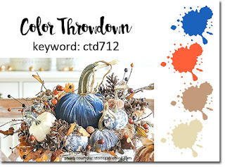
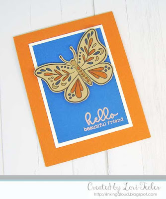
It's time for another Color Throwdown! Barbara is our hostess this week with a fun mix of complementary colors--blue, orange, kraft, and cream.The layout for my design comes from the current challenge at The Paper Players. I represented the layout's rectangular panel stretching across the cardfront with one of the butterfly images from Reverse Confetti's Beautiful Day stamp set. The image was stamped on kraft cardstock and colored with Copic markers, then cut out by hand. I used foam tape to position the image on a blue cardstock panel, angling it for interest. The set's "hello beautiful friend" sentiment was heat embossed at the bottom of the blue panel in rose gold. Aftermatting the panel on cream cardstock, I placed it on an orange card base to finish the design.
To play along, just create a paper crafted project using these colors as a starting point and add a direct link to your finished project using the linky tool found at the end of this week's CTD post. As always, if you don’t have exact color matches, something close works just fine. Just be sure that the challenge colors are the dominant ones in your project. And, if you upload your project to an online gallery, use the keyword CTD712. If you upload your projects on social media, go ahead and use the hashtag #ctd712 and #colorthrowdown. You can find us on Instagram and on Facebook with the username colorthrowdown. Before you get started, here’s some inspiration from the talented Color Throwdown team and this week's Guest Star Stamper Patricia.
** Amy Rohl ** Amy Rysavy ** Barbara **
** Broni ** Lisa ** Lynn **
** Susie ** Vickie ** Wanda **
** Guest Star Stamper Patricia **
Materials Used:
A Beautiful Day stamp set (Reverse Confetti); Memento Tuxedo Black and Versamark inks (Tsukineko/IMAGINE Crafts); markers (Copic); Pacific Point and Pumpkin Pie cardstock (Stampin' Up!); Kraft cardstock (Papertrey Ink); Rose Gold embossing powder (Lawn Fawn)


No comments:
Post a Comment