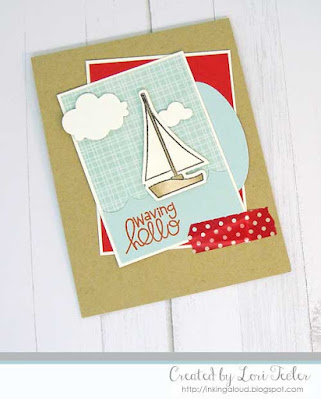
It's time for another Color Throwdown! Amy Rysavy is our hostess with a home decor inspired color palette--red, pale blue, kraft, and ivory.
I paired the challenge colors with the current sketch from Try Stampin' on Tuesday and stamps and dies from Paper Smooches. The focal panel was a perfect fit for the sailboat from PS's Wicked Nauticool stamp set. I stamped the boat on cream cardstock and colored it with kraft colored Copic markers. The boat was placed on a background made from pale blue grid patterned paper with a strip of pale blue "waves" along the bottom. I matted the image panel on cream cardstock before layering it on a kraft card base over a contrasting red cardstock panel, angling the panels for interest. As accents, I tucked half of a light blue oval panel beneath the right edge of the image panel and added a torn strip of red dotted washi tape at the bottom right corner. The "waving hello" sentiment was stamped in the lower left corner of the image panel. A pair of cream die cut clouds filled in the scene and finished the design.To play along, just create a paper crafted project using
these colors as a starting point and add a direct link to your finished project
using the linky tool found at the end of this week's CTD post. As always, if you don’t have exact color
matches, something close works just fine.
Just be sure that the challenge colors are the dominant ones in your
project. And, if you upload your project
to an online gallery, use the keyword CTD641.
If you upload your projects on social media, go ahead and use the
hashtag #ctd641 and #colorthrowdown. You can find us on Instagram and on
Facebook with the username colorthrowdown. Before you get started, here’s some inspiration from the talented Color
Throwdown team and this week's guest star stamper MaryKaren Matt
Materials Used:
Wicked Nauticool stamp set, Nauticool Icons and Clouds dies (Paper Smooches); Memento Tuxedo Black ink (Tsukineko/IMAGINE Crafts); Firebrick Crisp ink (Altenew); markers (Copic); Soft Sky and Poppy Parade cardstock (Stampin' Up!); Kraft cardstock (Papertrey Ink); Aqua Screen designer paper (Recollections); oval dies (Spellbinders); circle punches (EK Success); red dotted washi tape; foam tape


Lori, what a creative interpretation of our Try Stampin' on Tuesday sketch! I love how you chose the pattern paper for the "sky"! It really links the tan and blue elements of your card as a creative whole! Thank you so much for sharing!!! -Donna
ReplyDeleteLove this, Lori - your paper choices and beautiful coloring are always so stunning! So clever with that bit of washi! Thanks so much for playing at TSOT!
ReplyDeleteWhat a darling take on the two challenges - that color combo is killer! Thanks for sharing this over at TSOT.
ReplyDeleteCongratulations, Lori! Your card was chosen as one of our Try Stampin' on Tuesday's "Top 3" this week!!! -Donna
ReplyDelete