Showing posts with label Concord & 9th. Show all posts

Wednesday, July 2, 2025

Color Throwdown 836-Birthday Exclamation

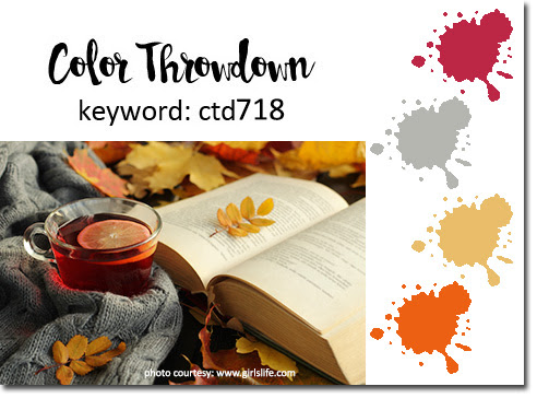
It's time for another Color Throwdown!  Lisa is our challenge hostess with a fun trio of colors--kraft, fuchsia, and orange.

Happy Birthday to You card-designed by Lori Tecler/Inking Aloud-dies from Concord & 9th

I'm trying to get a little bit ahead, so I created a birthday card that I'll give to a colleague during the upcoming school year. My focal image is a large die cut created with the Concord & 9th Exclamation die set. I mixed in all the challenge colors and added foam tape for interest before placing the die over layered circles on a white card base. A few orange enamel dies scattered around the cardfront finished the simple design.

To play along, just create a paper crafted project using these colors as a starting point and add a direct link to your finished project using the linky tool found at the end of this week's CTD post.  As always, if you don’t have exact color matches, something close works just fine. Just be sure that the challenge colors are the dominant ones in your project. And, if you upload your project to an online gallery, use the keyword CTD836. If you upload your projects on social media, go ahead and use the hashtag #ctd836 and #colorthrowdown.  You can find us on Instagram and on Facebook with the username colorthrowdown.  Before you get started, here’s some inspiration from the talented Color Throwdown team. 

** Amy ** Kelly **
  ** Lisa ** Lynn **
** Susie **  Vickie ** Wanda **
** Featured Stamper Kerry Parkinson **

Materials Used:
Exclamation dies (Concord & 9th); Pink Passion and Only Orange cardstock (Stampin' Up!); Kraft cardstock (Papertrey Ink); circle punches (EK Success); orange enamel dots (My Mind's Eye); foam tape

Wednesday, November 27, 2024

Color Throwdown 821-Thank You Times Three

It's time for another Color Throwdown! Tammy is our hostess this week with a pretty mix of colors inspired by vintage Christmas ornaments--yellow, green, and blue.

Thank You Times Three card-designed by Lori Tecler/Inking Aloud-stamps and dies from Concord & 9th
I paired the colors with the current challenge at The Paper Players for this simple thank you card design. My focal panel is a piece of blue on blue dotted paper with a large die cut "thank you" that incorporates all three of the challenge colors. The large die cut words are adhered to the dotted panel with foam tape, then surrounded with groupings of green enamel dots. For balance, I stamped "thank you, thank you" from Concord & 9th in blue ink on a yellow strip and added it to the dotted panel. After matting the panel on green cardstock, I positioned it on a blue card base with a wide diagonal strip of yellow cardstock stretching from side to side. I'm happy to report that this card is already in the mail to a recipient who generously provided a gift that will help to support the students at my school.

To play along, just create a paper crafted project using these colors as a starting point and add a direct link to your finished project using the linky tool found at the end of this week's CTD post.  As always, if you don’t have exact color matches, something close works just fine. Just be sure that the challenge colors are the dominant ones in your project. And, if you upload your project to an online gallery, use the keyword CTD821. If you upload your projects on social media, go ahead and use the hashtag #ctd821 and #colorthrowdown.  You can find us on Instagram and on Facebook with the username colorthrowdown.  Before you get started, here’s some inspiration from the talented Color Throwdown team.

** Amy Rohl **  Broni ** Tammy **
** Kelly ** Lisa ** Lynn **
** Susie **  Vickie ** Wanda **
** Featured Stamper Jennie Maier **

Materials Used:
Happy Thanks stamp set, Happy Thanks dies (Concord 9th); Memento Danube Blue ink (Tsukineko/IMAGINE Crafts); Lemon Tart and New Leaf cardstock (Papertrey Ink); Cape Cod cardstock, Blue Tonal Dots designer paper (Recollections); green enamel dots (Eyelet Outlet); foam tape

Wednesday, September 4, 2024

Color Throwdown 809-Make Some Noise


It's time for another Color Throwdown! Vickie is our hostess this week with a trio of cool, saturated colors--teal, purple, and green

Happy, Happy Birthday card-designed by Lori Tecler/Inking Aloud-stamps and dies from Concord & 9th

I paired the colors with the Make Some Noise stamps and dies from Concord & 9th for yet another birthday design. I used the dies to create two noisemakers from scraps of the challenge colors. I arranged them at the bottom of a white panel using foam tape for dimension. The "happy, happy birthday!" sentiment was stamped at the top of the panel in teal and purple inks. The layered sentiment stamps and my MISTI made it super easy to get the two-toned text lined up just right. I added a little green confetti at the ends of the noisemakers for a final festive touch before adhering the panel to a teal card base.

To play along, just create a paper crafted project using these colors as a starting point and add a direct link to your finished project using the linky tool found at the end of this week's CTD post.  As always, if you don’t have exact color matches, something close works just fine. Just be sure that the challenge colors are the dominant ones in your project. And, if you upload your project to an online gallery, use the keyword CTD809. If you upload your projects on social media, go ahead and use the hashtag #ctd809 and #colorthrowdown.  You can find us on Instagram and on Facebook with the username colorthrowdown.  Before you get started, here’s some inspiration from the talented Color Throwdown team.

** Amy Rohl **  Amy Rysavy ** Broni **
** Kelly ** Lisa ** Lynn **
** Susie **  Vickie ** Wanda **
** Guest Star Stamper Laura Rumble **

Materials Used:
Make Some Noise stamp set, Make Some Noise dies (Concord & 9th); Memento Grape Jelly and Bamboo Leaves inks (Tsukineko/IMAGINE Crafts); Cookie Monster ink (Taylored Expressions); New Leaf cardstock (Papertrey Ink); Ocean and Very Violet cardstock (Recollections); foam tape

Wednesday, July 31, 2024

Color Throwdown 804-Birthday Exclamation


It's time for another Color Throwdown! Amy Rohl is our hostess this week with a bold and vibrant mix of color inspired by a sunset--purple, orange, and yellow. 

Happy Birthday Exclamation card-designed by Lori Tecler/Inking Aloud-dies from Concord & 9th
I'm the team leader for the arts team (art/music/PE/media/counseling) at my school this year, so I want to be sure that I mark everyone's birthday with a card signed by all of our team members. That means I need to build up a stash of cards that are ready to use, so I'm starting with this challenge. I used the Exclamation dies from Concord & 9th for this fun birthday card. I went with yellow for the background for the birthday greeting, thinking that the darker orange and purple would pop against the yellow. The orange letters are adhered to the yellow panel with foam tape. The purple ones, which look blue here but are really purple (I promise!), were carefully glued right over the orange letters. Since the challenge colors are pretty bold on their own, I used a white background behind them. It's broken up by a strip of orange cardstock adhered to the middle of the panel. Before I added the birthday sentiment, I placed the set's exclamation point on the panel, angling it just a bit for interest. The finished panel was adhered to a yellow card base that matches the color behind the sentiment.

To play along, just create a paper crafted project using these colors as a starting point and add a direct link to your finished project using the linky tool found at the end of this week's CTD post.  As always, if you don’t have exact color matches, something close works just fine. Just be sure that the challenge colors are the dominant ones in your project. And, if you upload your project to an online gallery, use the keyword CTD804. If you upload your projects on social media, go ahead and use the hashtag #ctd804 and #colorthrowdown.  You can find us on Instagram and on Facebook with the username colorthrowdown.  Before you get started, here’s some inspiration from the talented Color Throwdown team.

** Amy Rohl **  Amy Rysavy ** Broni **
** Kelly ** Lisa ** Lynn **
** Susie **  Vickie ** Wanda **

Materials Used:
Exclamation dies (Concord & 9th); Orange Zest, Lemon Tart, and Royal Velvet cardstock (Papertrey Ink); foam tape

Wednesday, November 9, 2022

Color Throwdown 718-Grateful for You

It's time for another Color Throwdown! Lynn is our hostess this week with an autumnal mix of colors--cranberry, gray, gold, and rust.

Grateful For You card-designed by Lori Tecler/Inking Aloud-stamps and dies from Concord & 9th

The layout for my design is a loose interpretation of the current challenge at Try Stampin' on Tuesday. I replaced the layout's long vertical panel with an elegant leaf from Concord & 9th's Lace Leaf stamp set. The leaf was stamped in watermark ink and embossed with gold embossing powder then watercolored with rust and cranberry Zig markers. I carefully cut around the leaf with sharp scissors before using foam tape to adhere it to the left side of the rust card base on a slight angle. For the sentiment, I used C&9th's Grateful Leaves die set to cut the  word "grateful" from  gray cardstock. I adhered it to the cardfront so it overlapped the leaf, then stamped "for you" beneath it in black ink to finish the design.

To play along, just create a paper crafted project using these colors as a starting point and add a direct link to your finished project using the linky tool found at the end of this week's CTD post.  As always, if you don’t have exact color matches, something close works just fine.  Just be sure that the challenge colors are the dominant ones in your project.  And, if you upload your project to an online gallery, use the keyword CTD718.  If you upload your projects on social media, go ahead and use the hashtag #ctd718 and #colorthrowdown.  You can find us on Instagram and on Facebook with the username colorthrowdown.  Before you get started, here’s some inspiration from the talented Color Throwdown team and this week's Guest Star Stamper.

** Amy Rohl **  Amy Rysavy ** Barbara **
** Broni ** Lisa ** Lynn **
** Susie **  Vickie ** Wanda **
** Guest Star Stamper Rae Kryc **

Materials Used:
Lace Leaf stamp set, Grateful Leaf dies (Concord & 9th); Memento Tuxedo Black and Versafine inks (Tsukineko/IMAGINE Crafts); Really Rust cardstock (Stampin' Up!); Weathervane cardstock (Papertrey Ink); Zing! Gold embossing powder (American Crafts); foam tape

Wednesday, September 14, 2022

Color Throwdown 710-Birthday Bouquet

It's time for another Color Throwdown! Wanda is our hostess this week with colors from a non-traditional fall inspiration piece--aqua blue, cream, and kraft.

Happy Birthday card-designed by Lori Tecler/Inking Aloud-stamps and dies from Concord & 9th
I used the colors and some new to me floral dies to create a birthday card. The layout for my design is based on the current challenge at Try Stampin' on Tuesday. My floral focal point was made with Concord & 9th's Picked Posies dies. I arranged the pieces on an aqua circle using foam tape for dimension. The round panel was adhered to a cream panel over a piece of aqua striped patterned paper. To set the patterned paper off from the cream background, I tucked a narrow kraft strip beneath the bottom edge of the patterned paper. The "happy birthday" sentiment from C&9th's Birthday Stacks stamp set was stamped to the right of the florals in black ink. The panel was adhered to an aqua card base to complete the design.

To play along, just create a paper crafted project using these colors as a starting point and add a direct link to your finished project using the linky tool found at the end of this week's CTD post.  As always, if you don’t have exact color matches, something close works just fine.  Just be sure that the challenge colors are the dominant ones in your project.  And, if you upload your project to an online gallery, use the keyword CTD710.  If you upload your projects on social media, go ahead and use the hashtag #ctd710 and #colorthrowdown.  You can find us on Instagram and on Facebook with the username colorthrowdown.  Before you get started, here’s some inspiration from the talented Color Throwdown team and this week's Guest Star Stamper Donna Hardcastle.

** Amy Rohl **  Amy Rysavy ** Barbara **
** Broni ** Lisa ** Lynn **
** Susie **  Vickie ** Wanda **
** Guest Star Stamper Donna Hardcastle **

Materials Used:
Birthday Stacks stamp set, Picked Posies dies (Concord & 9th); Versafine Clair Nocturne ink (Tsukineko/IMAGINE Crafts); Bermuda Bay cardstock (Stampin' Up!); Kraft cardstock (Papertrey Ink); Lucky Charm 6x6 paper pad (American Crafts); circle dies (Spellbinders); foam tape

Friday, August 27, 2021

Color Me Thankful


Here's my card for the current Fusion challenge. I paired the sketch with elements from the inspiration photo (crayon images, rainbow color scheme) for this fun thank you card design.

Color Me Thankful card-designed by Lori Tecler/Inking Aloud-stamps and dies from Concord & 9th
My rainbow array of crayons was created with the Color Me Happy dies from Concord & 9th. I arranged them along the left side of a white cardstock panel, varying the placement of the crayons for interest. I stamped the "color me thankful" sentiment from the coordinating Color Me Happy stamp set in black ink on a white panel. The text was matted on a black panel, then added over the crayons using foam tape for dimension. The finished panel was adhered to a purple card base. I debated for a while before going with purple.

Materials Used:
Color Me Happy stamp set, Color Me Happy dies (Concord & 9th); Memento Tuxedo Black ink (Tsukineko/IMAGINE Crafts); Red Punch and Ocean cardstock (Recollections); Only Orange, Yoyo Yellow, Green Galore, Lovely Lilac, and Basic Black cardstock (Stampin' Up!); foam tape

Sunday, August 8, 2021

So Very Thankful

So Very Thankful card-designed by Lori Tecler/Inking Aloud-stamps from Concord & 9th
Here's my card for the current challenge at Freshly Made Sketches. The large leaf from Concord & 9th's Lace Leaf stamp set was perfect as a focal image for the design. The leaf was stamped in gold pigment ink on cream cardstock and heat embossed in gold. The embossed image was watercolored with a mix of Zig Clean Color markers and a water brush, creating a pretty gradient of colors. I layered the panel on to a coordinating golden yellow card base. For the sentiment, I stamped the "so very thankful" sentiment on two narrow cardstock strips, one golden yellow and one orange. The strips were positioned at the bottom of the stamped panel. I adhered a narrow strip of gold foil cardstock to the left edge of the panel to bring in another gold element and to complete the design.

Materials Used:
Lace Leaf stamp set (Concord & 9th); Memento Tuxedo Black and Delicata Golden Glitz inks (Tsukineko/IMAGINE Crafts); Clean Color markers (Zig); Harvest Gold and Orange Zest cardstock (Papertrey Ink); Gold Foil cardstock (Recollections); Gold Zing! embossing powder (American Crafts)

Monday, August 2, 2021

Brighter Days Are Ahead

Brighter Days Are Ahead card-designed by Lori Tecler/Inking Aloud-stamps and dies from Concord & 9th

Here's my card for the current challenge at CAS Colours and Sketches. I couldn't resist going with a rainbow for the repeated stripes at the right side of the cardfront. My strips were made from cardstock scraps that I arranged in rainbow order on a light blue card base. I topped the rainbow with a die cut sun created with a die from Concord & 9th's Brighter Days die set. The sun was added to the cardfront, then topped with a cloud cut from shimmery white cardstock. The "brighter days are ahead" sentiment from the Brighter Days set was stamped on the cloud in black ink. For more sparkle and shine, I added a trio of silver sequin raindrops beneath the cloud to finish the design.

Materials Used:
Brighter Days stamp set, Brighter Days and Rainbow Wishes dies (Concord & 9th); Memento Tuxedo Black ink (Tsukineko/IMAGINE Crafts); Red Punch and Ocean cardstock (Recollections); Only Orange, Daffodil Delight, Green Galore, Lovely Lilac, and Shimmery White cardstock (Stampin' Up!); silver sequins; foam tape

Friday, June 4, 2021

So Much Color

So Much Color card-designed by Lori Tecler/Inking Aloud-stamps from Concord & 9th

Here's my card for the current Perfectly CAS challenge. The challenge's repeat stamping theme ws perfect for the brushstroke image in Concord & 9th's Color Me Happy stamp set. I used a rainbow array of inks to stamp the image repeatedly at the center of a white cardstock panel. The stamp was stamped on scrap paper before I inked the cardstock panel to get a softer color value. After I finished stamping the six stripes, I stamped the set's "you bring so much color to my world" sentiment over them in black ink, using my MISTI so that I could double stamp it for a bold, dark impression. The panel was matted on black cardstock then adhered to a turquoise cardbase matching the bottom stripe in the array.

Materials Used:
 Color Me Happy stamp set (Concord & 9th); Memento Tuxedo Black, Lady Bug, Tangelo, Dandelion, Bamboo Leaves, and Bahama Blue inks (Tsukineko/IMAGINE Crafts); Tempting Turquoise and Basic Black cardstock (Stampin' Up!)

Friday, May 21, 2021

Brighter Days Are Ahead

Brighter Days Are Ahead card-designed by Lori Tecler/Inking Aloud-stamps and dies from Concord & 9th
Here's my card for the current sketch at Try Stampin' on Tuesday. My rainbow element for the layout was created with some of Concord & 9th's Rainbow Wishes dies. I arranged the three bands on a light blue cardfront, then adhered a strip of aqua gingham paper just beneath the bottom of the bands. The "brighter days are ahead" sentiment from C& 9th's Brighter Days stamp set was stamped on a turquoise cardstock strip from my scrap pile, then adhered over the gingham strip. I used one of the dies from the Brighter Days die set to cut a cloud from shimmery white cardstock to position at the left side of the rainbow. I added a trio of iridescent sequins beneath the cloud for some sparkle and shine. For balance, I added a sun die cut created with another die from the Brighter Days die set to the right side of the rainbow to finish the card.

Materials Used:
Brighter Days stamp set, Rainbow Wishes and Brighter Days dies (Concord & 9th); Memento Tuxedo Black ink (Tsukineko/IMAGINE Crafts); Real Red, Tempting Turquoise, and Yoyo Yellow cardstock (Stampin' Up!); Ocean cardstock (Recollections); Crystal Stardream metallic cardstock (The Paper Cut); Aqua Mist patterned paper (Papertrey Ink); iridescent sequins; foam tape

Friday, April 9, 2021

The World Is Lucky to Have You

The World Is Lucky to Have You card-designed by Lori Tecler/Inking Aloud-stamps and dies from Concord & 9th

Here's my card for the current Sunday Stamps challenge. The challenge was to make a slimline card with a large sentiment as the focal image. I shrunk my slimline card down to a mini slimline that was a perfect fit for the large die cut "lucky" from Concord & 9th's Lucky die set. The word was cut from navy blue cardstock. For interest I stamped the matching stamp from the Lucky stamp set on the die cut with watermark ink and heat embossed the text in a turquoise blue. The word was adhered to a light blue cardstock panel, angling it for interest. The outline of the word was die cut from silver and adhered directly to the panel. It adds a nice detail to the panel. I stamped the "the world is" and "to have you" sentiments from the Lucky stamp set in navy ink around the die cut word and accented the die cut with a mix of silver sequins. The panel was matted on turquoise cardstock to match the embossing, then adhered to a navy card base matching the die cut piece.

Materials Used:
Lucky stamp set, Lucky dies (Concord & 9th); Memento Nautical Blue and Versamark inks (Tsukineko/IMAGINE Crafts); Sno Cone cardstock (My Favorite Things); Night of Navy cardstock (Stampin' Up!); Ocean and Silver cardstock, Glacier embossing powder (Recollections); silver sequins; foam tape

Sunday, March 14, 2021

Brighter Days

Brighter Days Are Ahead card-designed by Lori Tecler/Inking Aloud-stamps and dies from Concord & 9th

Here's my card for the current sketch at Freshly Made Sketches. I used the trio of stripes to create a simple rainbow at the corner of a light blue card base. The rainbow was topped with a die cut sun and a pair of clouds created with Concord & 9th's Brighter Days dies. For contrast and interest, I filled in the center of the sun with a yellow gingham circle. I added a trio of silver sequin raindrops beneath the clouds.  The "brighter days are ahead" sentiment from the Brighter Days stamp set was stamped among the raindrops in blue ink to finish the design.

Materials Used:
Brighter Days stamp set, Brighter Days dies (Concord & 9th); Memento Bahama Blue ink (Tsukineko/IMAGINE Crafts); Soft Sky cardstock (Stampin Up!); Red Punch and Ocean cardstock (Recollections); Bright Buttercup cardstock, Lemon Tart patterned paper (Papertrey Ink); Crystal Stardream metallic cardstock (The Paper Cut); circle punch; silver sequins; foam tape

Friday, December 25, 2020

Peace Love & Joy

Peace Love & Joy card-designed by Lori Tecler/Inking Aloud-stamps from Concord & 9th

Merry Christmas to those who are celebrating today--however that may be in these unusual times!  Since today is Christmas Day, it seemed appropriate to share the holiday card I mass produced to send to family and friends this year.  I have to admit that it was a challenge to get motivated to do this, but not only did I make the cards, I got them in the mail a week before Christmas!  Like many people, I haven't felt really festive or been too interested in celebration.  While I've been fortunate that my family and I have been healthy, I can say it's been a rough year. I work in the elementary curriculum office for one of the largest school districts in the US and the demands of my job have been intense since February when we first started having discussions about "what if" the virus caused schools to close for "a little while."  Fast forward ten months later and the school system that I work for has yet to reopen and my workload has only increased.  I'm hoping that things will settle into a more manageable pace as we head into the new year, but with trying to plan for a return to school, I doubt that is coming anytime soon...

Anyway, I didn't create anything fancy for my holiday card design--I just didn't have the time or the ability to make it happen.  I went with a simple monochromatic color scheme that's non-traditional for the holidays.  The purple is soothing and looks so pretty with the trio of silver embossed snowflakes from Concord & 9th's Snow Flurry stamp sets.  They were stamped on the lightest purple cardstock with the help of my MISTI.  For extra sparkle, the center of each flake was dotted with a small clear crystal.  I added the "peace love & joy" sentiment from the Full of Joy set to the right of the snowflake cluster in dark purple ink, again using my MISTI to speed things up.  To add interest, I used a cable knit embossing folder to add texture to a medium shade of purple cardstock.  A cable knit strip was added to the bottom of the stamped panel, edged at the top with a narrow strip of silver cardstock. The finished panel was adhered to a dark purple card base matching the color of the sentiment. I wrote on the inside of the cards with a purple pen to match.

Materials Used:
Full of Joy and Snow Flurry stamp sets (Concord & 9th); Memento Grape Jelly and Delicata Silvery Shimmer inks (Tsukineko/IMAGINE Crafts); Very Violet and Silver cardstock (Recollections); Sterling Silver embossing powder (Stampin' Up!); Cable Knit embossing folder (Sunny Studio Stamps); clear self-adhesive crystals

Wednesday, November 4, 2020

Color Throwdown 618-Grateful for You

It's time for another Color Throwdown!  Lynn is our hostess this week with a mix of colors inspired by a fall tossed salad--green, brown, orange, and cranberry.

Grateful for You card-designed by Lori Tecler/Inking Aloud-stamps and dies from Concord & 9th

I paired the colors with the layout from the current challenge at CAS(e) this Sketch.  The heart shaped leaf images in the Give Thanks set from Concord & 9th were a perfect match for the colors. I randomly stamped the solid leaf image on a white panel in inks matching the challenge colors, then added the brown vein image on top.  For the sentiment, I die cut the word "grateful" three times from brown cardstock using a die from the Grateful Leaf die set.  After layering the pieces for dimension, I adhered them to the stamped panel.  I stamped "for you" in brown ink on a strip of cranberry cardstock and added that beneath the die cut word, using foam tape to set it off from the stamped background. The finished panel was adhered to a cranberry card base to match the sentiment strip.

To play along, just create a paper crafted project using these colors as a starting point and add a direct link to your finished project using the linky tool found at the end of this week's CTD post.  As always, if you don’t have exact color matches, something close works just fine.  Just be sure that the challenge colors are the dominant ones in your project.  And, if you upload your project to an online gallery, use the keyword CTD618If you upload your projects on social media, go ahead and use the hashtag #ctd618 and #colorthrowdown.  You can find us on Instagram and on Facebook with the username colorthrowdown.  Before you get started, here’s some inspiration from the talented Color Throwdown team and this week's Guest Star Stamper Melissa Rivera.

** Amy Rohl **  Amy Rysavy ** Barbara ** Broni ** 
** Lisa ** Lynn ** Vickie ** Wanda **
** Guest Star Stamper Melissa Rivera  **

Materials Used:
Give Thanks and Lace Leaf stamp sets, Grateful Leaf dies (Concord & 9th); Memento Rhubarb Stalk, Tangelo, Bamboo Leaves, and Rich Cocoa inks (Tsukineko/IMAGINE Crafts); Cranberry Crisp and Close to Cocoa cardstock (Stampin' Up!); foam tape

Saturday, October 17, 2020

Hello


Hello Frame card-designed by Lori Tecler/Inking Aloud-stamps and dies from Concord & 9th
Here's my card for the current challenge at Global Design Project.  Instead of a round frame, I used the angular frame from Concord & 9th's Modern Frame die set to create a golden focal point for my design.  After cutting the frame from shiny gold foil cardstock, I positioned it at the center of a purple patterned paper panel.  The frame was embellished with a pair of flowers and some leafy foliage cut with dies from the same set.  For the sentiment, I stamped "hello" from the coordinating Modern Frame stamp set in dark purple ink on a purple fishtail flag strip. The stamped strip was adhered over the frame using foam tape for dimension. I matted the panel on gold paper before I adhered it to a purple cardbase with a darker purple panel on top.  The image panel was angled for interest--and to go with all of the angles in the elegant frame.

Material Used:
Modern Frame stamp set, Modern Frame dies (Concord & 9th); Memento Grape Jelly ink (Tsukineko/IMAGINE Crafts); Royal Velvet and Ripe Avocado cardstock (Papertrey Ink); Orchid Opulence cardstock (Stampin' Up!); Gold Foil cardstock (Recollections); Kioshi 6x6 paper pad (Basic Grey); Fishtail Flag STAX dies (My Favorite Things); Pink Pearl Liquid Pearls (Ranger); foam tape

Saturday, September 19, 2020

Sending You Hugs

Here's my card for the current challenge at Global Design Project.  I used the sketch along with stamps and dies from Concord & 9th for a love themed design.

Sending You Hugs card-designed by Lori Tecler/Inking Aloud-stamps and dies from Concord & 9th

I started off by finding a pair of coordinating patterned papers to use for the trio of panels on the cardfront.  The cross-stitched heart patterned paper strips book ended a grid patterned paper, both with shades of rosy pink to tie them together.  I arranged the papers on a greige panel that I adhered to a rose card base.  For the sentiment, I die cut the large word "hugs" from rose cardstock three times.  After layering the pieces for dimension they were adhered to the center of the card. To finish the sentiment, I stamped "sending you" in rose ink on a strip of greige cardstock.  The stamped strip was adhered above the die cut word using foam tape for dimension.

Materials Used:
Cuddles & Hugs stamp set, Cuddles & Hugs dies (Concord & 9th); Memento Rose Bud ink (Tsukineko/IMAGINE Crafts); Sahara Sand and Regal Rose cardstock (Stampin' Up!); Cut & Paste 6x6 paper pad (Amy Tangerine); rose enamel hearts (Recollections); foam tape

Tuesday, September 15, 2020

Birthday Mail

Here's my card for the current Paper Craft Crew challenge.  I used the layout to make a fun interactive birthday card with stamps and dies from Concord & 9th.  

Birthday Mail card-designed by Lori Tecler/Inking Aloud-stamps and dies from Concord & 9th
I used stamps from the Mail Drop stamp set and silver cardstock to create the mailbox. The pieces were assembled so that the mailbox "door" drops open to reveal the "happy birthday" sentiment stamped inside.  The mailbox's flag was pieced with a scrap of red cardstock for a pop of color.  I made a background for the mailbox by stamping the Confetti Turnabout stamp a single time on a pink panel in rosy red ink.  After adhering a red fishtail flag strip to the panel, I added the mailbox on top, using foam tape for dimension.  I accented the mailbox with a die cut red heart dressed up with a tiny pink and red twine bow.

Materials Used:
Mail Drop, Happy Balloons, and Confetti Turnabout stamp sets, Mail Drop dies (Concord & 9th); Memento Tuxedo Black and Gray Flannel inks (Tsukineko/IMAGINE Crafts); Flamingo ink (Reverse Confetti); Sweet Blush cardstock (Papertrey Ink); Red Punch and Silver cardstock (Recollections); Fishtail Flag STAX dies (My Favorite Things); baker's twine; foam tape

Sunday, August 2, 2020

Party Like There's No Mañana

Here's my card for the current challenge at CAS Colours and Sketches.  I went with a fun and colorful design featuring the Piñata Party stamps and dies from Concord & 9th.

Party Like There's No Mañana card-designed by Lori Tecler/Inking Aloud-stamps and dies from Concord & 9th
I die cut the piñata image from white cardstock, then used a bunch of different vivid color inks to stamp the fringe image repeatedly on the die cut until it was covered.  For definition, I added the bridle and blanket die cuts before using foam tape to adhere the image to a yellow die cut circle. The circle was matted on black cardstock for contrast.

For the background, I adhered a strip of red cardstock to the lower portion of a yellow striped paper panel that mirrors the look of the fringed stamping on the image.  The red strip was edged with narrow strips of black cardstock to match the mat beneath the image panel.  I stamped the set's "party like there's no mañana" sentiment on a narrow yellow strip and added it across the red strip before placing the image panel on top. The striped panel was matted on black cardstock, then adhered to a yellow card base to match the image panel.

Materials Used:
Piñata Party stamp set, Piñata Party dies (Concord & 9th); Memento Lady Bug, Tangelo, Dandelion, Lime Tart, and Tuxedo Black inks (Tsukineko/IMAGINE Crafts); Red Punch cardstock (Recollections); Yoyo Yellow and Basic Black cardstock (Stampin' Up!); Lemon Tart patterned paper (Papertrey Ink); circle dies (Spellbinders); foam tape

Sunday, June 21, 2020

Brighter Days

Here's my card for the current sketch at Freshly Made Sketches.  It's kind of a loose interpretation of the sketch, but I think it still works!

Brighter Days Are Ahead card-designed by Lori Tecler/Inking Aloud-stamps and dies from Concord & 9th
I used dies from Concord & 9th to put this cheery design together quickly. The rainbow bands were cut from cardstock scraps using dies from the Rainbow Wishes set, then adhered to a light blue cardfront. I cut the sun rays from yellow cardstock and positioned the die cut piece at the top left of the rainbow bands.  The open center (the sun, I guess) was filled in with a bit of a yellow striped circle.  I die cut a cloud from shimmery white cardstock and stamped the "brighter days are ahead sentiment from the Brighter Days stamp set in teal ink, then used foam tape to adhere it to the bottom right side of the rainbow bands.  I might go back and add a few sequins for a little sparkle...

Materials Used:
Brighter Days stamp set, Brighter Days and Rainbow Wishes dies (Concord & 9th); Memento Teal Zeal ink (Tsukineko/IMAGINE Crafts); Sno Cone cardstock (My Favorite Things); Bright Buttercup cardstock, Lemon Tart patterned paper (Papertrey Ink); Ocean and Red Punch cardstock (Recollections); Shimmery White cardstock (Stampin' Up!); foam tape
 
Blogging tips