Wednesday, June 30, 2010

Sunshine

I got home late tonight from work and had a bunch of things to do, so I had time for just a quick card for today's SCS sketch challenge. I combined the sketch with this week's Unity Addicts Challenge to use a quote or sentiment as the focal image on your project--that helped my card to come together pretty fast.

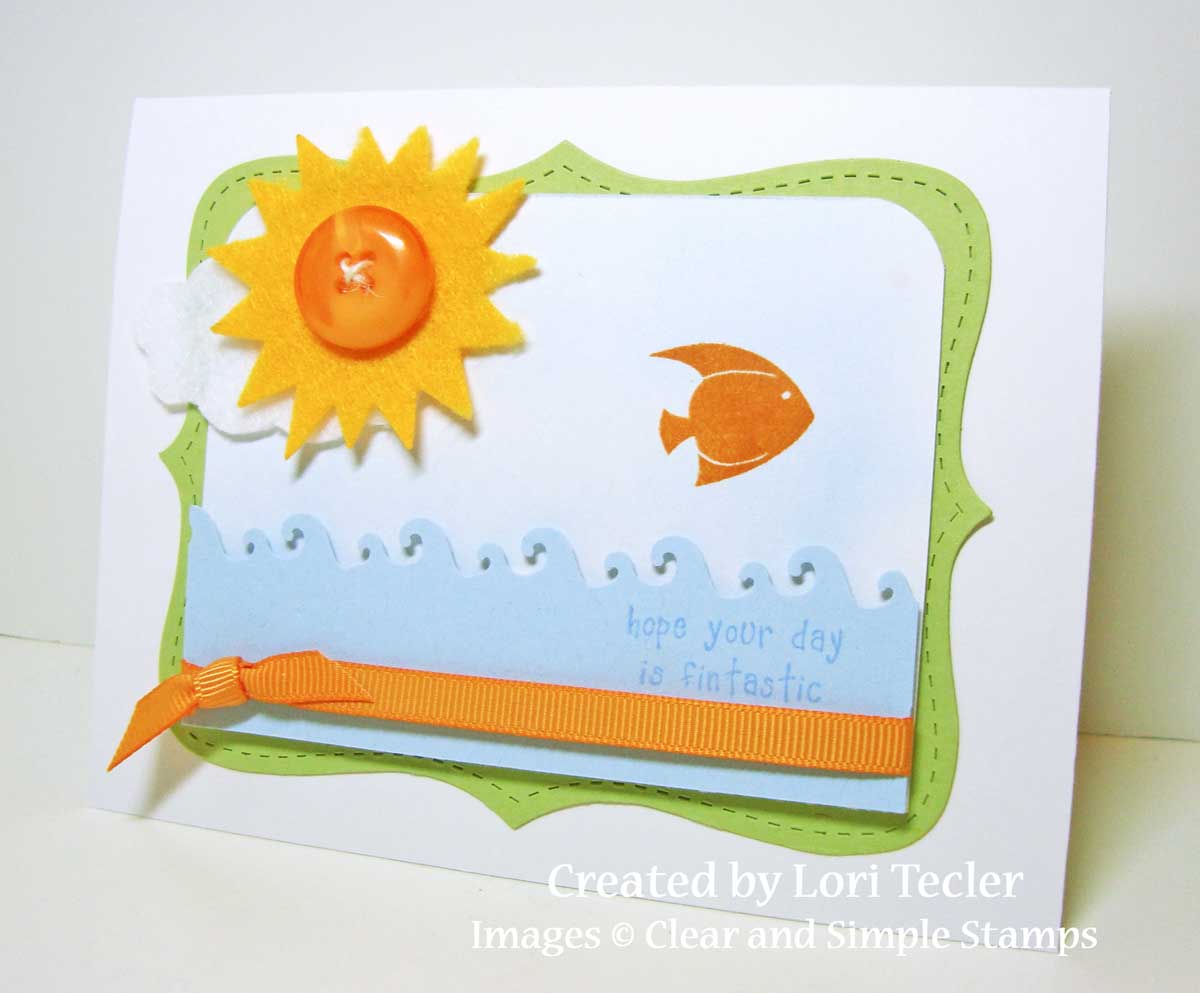
I picked a quote from the October (2009) Kit of the Month for my focal image. I inked most of it in blue ink, except for the word "sunshine." That single word was inked with an orange marker to stand out from the rest of the quote. I inked around the edges of the panel with a coordinating blue ink, then added a die cut felt sun as a fun embellishment.

I paired the image with papers from two different My Mind's Eye lines. Even though they're from different lines, the color tones worked okay together. A bright satin ribbon tied around the bottom of the card finished it off.

And, speaking of Unity, if you're looking to add some to your collection, be sure to stop by i {heart} papers. Kate has marked down most of her Unity stock, plus hundreds of other products, to make room for the new goodies she'll be ordering at CHA next month.

Materials Used:
October 2009 Kit of the Month (Unity Stamp Co.); Hawaiian Shores ink, Hawaiian Shores cardstock, Summer Sunrise satin ribbon, Orange Zest button (Papertrey Ink); Cool Caribbean ink, Pumpkin Pie marker, Whisper White cardstock, Pumpkin Pie grosgrain ribbon (Stampin' Up!); So Sophie and Abbey Road designer papers (My Mind's Eye); sun die (My Favorite Things)

Happy Birthday Tweet Thang

Here’s my card for this week’s Our Craft Lounge sketch challenge. I made a few little changes to the sketch to make it work with the image I chose.

I used one of the cute bird images from the Tweet Thang set as my focal image. The bird is colored with Copic markers. I stamped the wing a second time on a scrap of cardstock, colored it in and cut it out, then attached it to the bird image with foam tape. I combined a few of the set’s sentiments on my card. The “happy birthday” is stamped on a rounded edge panel and attached to the card with foam tape. I added a yellow button with a white pen faux thread to the end of the strip. The “tweet thang” part of the sentiment is stamped on scraps of aqua cardstock and cut apart, then added to the cardfront.

I used a pair of October Afternoon Thrift Shop designer papers for the panels on the cardfront. I went with a cheery yellow plaid and a blue and yellow floral print. A piece of aqua pom pom trim is wrapped around the top of the yellow plaid, right where the two papers meet.

Materials Used:
from
i {heart} papers: Our Craft Lounge Tweet Thang stamp set, Couture Cardstock medium weight white Copic blending cardstock, Memento Tuxedo Black ink, Copic markers (BG0000, BG10, BG11, BG13, BG15, Y13, R81), Basic Grey Kioshi button, October Afternoon Thrift Shop designer paper, Alexx Kesh aqua pom pom trim, Ranger Inkssentials white pen, Nestabilities rectangle and scalloped rectangle dies

other: Crushed Curry cardstock (Stampin' Up!); Aqua Mist cardstock (Papertrey Ink)

SOTM Sneak Peek


Want a sneak peek of the newest set from Clear and Simple Stamps? The set will be released tomorrow, but you can see a card I created using images from July's Stamp of the Month on the CSS iPhone app. You can check out all the info about the app here.

Tuesday, June 29, 2010

Congratulations on Your New Home

Here’s my card for this week’s Taylored Expressions sketch challenge. I used one of the digi images from the June Chicken Girl Design release, available exclusively at i {heart} papers, for the card.

The New Home digi image is printed on white cardstock and colored with Copic markers. I added an airbrushed sky behind it (with the help of Chloe the cutie puppy, who was chewing my airbrush’s hose while I worked . . . something about the braided hose really interests her for some reason I can't figure out) and some Glossy Accents to cover the windows for a glass-like appearance.

I left plenty of room at the right side of the image panel to add a pretty ribbon embellishment. I stretched a piece of olive crepe ribbon over the panel and added a matching bow with a brown corduroy brad at the center.

The colored image is layered on a coordinating piece of Basic Grey’s Origins designer paper. I used another piece of Origins paper for the grid-patterned scalloped strip underneath the image. The earthy colors in the papers were perfect for finishing a warm-feeling new home congratulations card.

Materials Used:
from
i {heart} papers: Chicken Girl Design New Home digi image, Couture Cardstock white medium weight Copic blending cardstock, Copic markers (Y11, Y13, Y18, YG11, YG13, YG17, E35, E37, E39, E99, B0000, B21, YR16, YR24), Ranger Glossy Accents, Creative Impressions olive crepe ribbon, Bow Easy, Zva Creative brown corduroy brad, Basic Grey Origins designer paper

other: Old Olive cardstock, scallop edge punch (Stampin’ Up!)

Enjoy the Ride

Susanna shared a great, simple sketch for this week’s Paper Craft Planet sketch challenge. The one new stamp set I picked up over the weekend at my visit to the Great American Scrapbooking Convention and two not-so-local stamping/scrapping stores was perfect for the challenge.

I have a “thing” for bunnies, so I had to have the Joyride set from The Cat’s Pajamas with its fun bunny image. The bunny on a scooter was a great fit for the set’s large round panel. It’s colored with Copic markers. Instead of coloring them in, I added a few sparkly rhinestones for the scooter’s lights. To ground the image, I drew in a road beneath the scooter and added a soft sky background with my airbrush.

I stamped the set’s coordinating “enjoy the ride” sentiment on a circle panel and added it to the image panel, dressed up with a button-embellished bow. I switched the sentiment from the right side to the left to work better with my image, but otherwise stuck to the sketch.

If you have a chance to play along, upload your card to the PCP gallery with the keyword sk062610 so that it can be added to the album with the rest of this week’s creations.

Materials Used:
Joyride stamp set (The Cat’s Pajamas); white cardstock, Tiny Twinkles (Taylored Expressions); Tuxedo Black ink (Memento); markers (Copic); Real Red, Brocade Blue, and Bashful Blue cardstock, (Stampin’ Up!); circle and scalloped circle dies (Nestabilities); circle punches (EK Success); red satin ribbon (Target); button, twine (Papertrey Ink); self-adhesive rhinestone (Darice); foam tape

Monday, June 28, 2010

Fintastic

Here's my summery scene for today's SCS clean and simple challenge to use blue, celery, and pumpkin. I added in a bit of white with a beachy themed stamp set for this fun card.

I started with a white panel with rounded top corners. The panel was softly airbrushed with a pale blue Copic marker for a subtle cloudy blue sky. I stamped the fish image from the Surf set from Clear and Simple Stamps in the sky with pumpkin ink. I added a felt cloud and sun in the corner to fill out the sky.

I used a wave border punch for the water at the bottom of the panel. I stamped the sentiment on the border punched strip and added an orange ribbon underneath as an accent. The wave's attached to the panel with foam tape for a little dimension. I layered the scene on a celery Top Note die cut, then on a white cardfront to finish the card.

Materials Used:
Surf stamp set (Clear & Simple Stamps); Pumpkin Pie and Bashful Blue Classic inks, Bashful Blue and Certainly Celery cardstock, Top Note die, Pumpkin Pie grosgrain ribbon (Stampin' Up!); white cardstock (Georgia Pacific); B21 marker (Copic); cloud, sun Die-Namics dies (My Favorite Things); orange button, twine (Papertrey Ink); Boundary Waters border punch (Fiskars); foam tape

Simply Thinking of You

Here’s my card for this week’s CAS-Tastic Wednesday challenge to create a clean and simple card using yellow, blue, and a neutral. I turned to my Mint Motif stamps from i {heart} papers for this simple creation.

I stamped the cloud image from Very Square in blue ink four times on white paper and trimmed around each image. The images are set on a darker blue panel, then on a yellow card base. I used a circle punch to make a round opening in the center one of the cloud panels, creating a window showing the inside of the card.

For the inside, I stamped the cloud image one more time and again cut it out and layered it on a darker blue mat before setting it on the inside of the card. I was careful to line up the image so that the part of the image you see through the opening matches up with the image on the front of the card.

I used the punched out piece to make a popped up sentiment panel. Again, I carefully lined up the image before stamping the sentiment from the coordinating Very Square Sentiments set in darker blue ink and setting it in place with a pair of foam dots, layered for extra height. I added a sparkly crystal flourish and a pretty light blue crepe bow as accents. Even with the extra elements, I think I still ended up with a clean and simple creation.

Materials Used:
from
i {heart} papers: Mint Motif Very Square and Very Square Sentiments stamp sets, Creative Impressions light blue crepe ribbon, Bow Easy, Zva Creative crystal flourish

other: Spring Rain ink, Enchanted Evening cardstock (Papertrey Ink); Barely Banana and Whisper White cardstock (Stampin’ Up!); circle punches (EK Success); foam tape

Sunday, June 27, 2010

Summertime Winter Wishes

It's been unseasonably and unbelieveably hot (and humid, too) here for the last week or two. In fact, it's been so hot that I switched things up so that Chloe the cutie puppy and I took our long walk early this morning instead of the usual late afternoon/early evening. Given the current weather conditions, it felt nice to pull out some cold weather stamps for this card for today's SCS featured stamper challenge. My card's based on this one--my eye was really drawn to its layout.

I kept the winter image/theme the same and made a few adjustments to the layout so it would fit on a standard A2 card instead of a square one. I used two patterned papers from Papertrey Ink's Rustic Snowflakes pack to cover the Aqua Mist cardfront.

For the focal image, I stamped the mittens from PTI's Snowfall stamp set in Aqua Mist ink on white cardstock and carefully cut them out (hope they'll be adding dies for these mittens to their collections!). I stamped a red snowflake on each one and added a tiny rhinestone at the center of the snowflakes. A piece of twine connects them and is threaded through the knotted ribbon that runs across the cardfront. I stamped the "warm winter wishes" sentiment in red ink on a white panel and slipped it underneath the top of the ribbon to finish the card.

Materials Used:
Snowfall stamp set, Aqua Mist ink, Aqua Mist and Spring Moss cardstock, Rustic Snowflakes patterned paper, Aqua Mist grosgrain ribbon, twine (Papertrey Ink); Real Red Classic ink, Whisper White cardstock (Stampin' Up!); circle and scalloped circle dies (Nestabilities); Tiny Twinkles (Taylored Expressions); foam tape

I'm Lucky

Here’s my card for this week’s SCS sketch challenge and My Favorite Things Wednesday Stamp Club challenge to use cork or felt on your project. Since I’d just picked up some new felt at the craft store (can you believe I didn’t have white for clouds . . .), I figured I’d go the felt route.

I used the adorable Pure Innocence 4-Leaf Clover as my focal image. She’s colored up with Copic markers. I added a little Stickles sparkle to the little heart in her hair and the clover in her hand, too.

She’s set on a blue sky felt background, complete with green felt die cut grass under her feet and white felt clouds above her in the sky. I stitched the clouds on with my sewing machine to add some texture to the felt. The felt panel is layered on a lightweight piece of white scrap cardstock to give it some support and to make it easier to attach to the cardfront.

The rest of the card’s pretty simple. I used a pair of patterned paper scraps for the panels on the celery card base. I dressed them up with a piece of white ribbon with a button-embellished bow at the end. The set’s “I’m lucky you’re my friend” sentiment fit along the bottom edge of the cardfront.

Materials Used:
Pure Innocence 4-Leaf Clover stamp set, grass and cloud dies (My Favorite Things); white cardstock (Taylored Expressions); Tuxedo Black ink (Memento); markers (Copic); Bashful Blue Classic ink, Certainly Celery and Bashful Blue cardstock, Bashful Blue Prints designer series paper (Stampin’ Up!); Flower Shower matstack (DCWV); Spring Rain button, twine (Papertrey Ink); Lime Green and Yellow Stickles (Ranger); white ribbon (?); felt; sewing machine; foam tape

Saturday, June 26, 2010

So Sweet

Here’s my card for the latest Mojo Monday sketch. I used one of the bear images from the new Antidepresstamps line available at Starving Artistamps for the focal image. These bears are just too cute! If you missed the blog hop marking the debut of these images earlier this week, you can find links to all the stops here.

I used the Love Bear image on this card. The bear is colored with Copic markers, then layered on a cream panel with brown inked edges. The heart above its head is filled in with a red Spica pen for a little shimmer and sparkle. I stamped the “so sweet” sentiment from the Simple Sweet Sayings set on a fancy edged blue panel and attached it under the image panel like a tab.

I used a trio of patterned papers from the My Mind’s Eye Be Loved collection for the cardfront. The pattern with the largest scale covers most of the cardfront and the other two make nice accent panels. To add some texture, I wrapped a piece of blue twill around the top of the blue striped paper. Three copper brads run along the bottom of the panel.

The 10% discount code at Starving Artistamps for my readers will be expiring on July 15, so if you want to use the code to place an order, please keep that in mind. Until July 15, you can use the code savetenLT to save 10% on your stamp purchases. Happy shopping!

Materials Used:
Antidepresstamps Love Bear image and Simple Sweet Sayings set (Starving Artistamps); white cardstock (Taylored Expressions); Tuxedo Black ink (Memento); markers, red Spica pen (Copic); Aqua Mist cardstock, Hawaiian Shores ink (Papertrey Ink); Creamy Caramel ink, Very Vanilla cardstock (Stampin’ Up!); Be Loved designer paper (My Mind’s Eye); Labels 9 die (Nestabilities); blue twill (Martha Stewart); copper brads (Making Memories); foam tape

You're My Number One

Here’s my card for last week’s Bellarific Friday challenge from Stamping Bella. I inked up my You’re My Number One-abella for the sketch challenge.

I took my color inspiration from the colors in the bold number print paper I used for the panel on the left side of the card. I don’t think I would have done a primary color schemed card like this one without that paper. I colored the Bella with Copic markers and added a Liquid Pearl necklace (that kinda got a little blobby . . . ). The “1” is highlighted around the edges with a yellow marker for a fun glow.

The rest of the card’s pretty simple since the colors are bold. I embossed the blue panel with a dot pattern to match the dots on the “1” and added a little bit of yellow satin ribbon. I layered everything on a black cardfront.

This morning, I'm off to the Great American Scrapbook Convention in Northern Virgina for some browsing and shopping. I'll be back later with another project.

Materials Used:
You’re My Number One-abellaimage and sentiment (Stamping Bella); white cardstock (Taylored Expressions); Tuxedo Black ink (Memento); markers, Red Spica pen (Copic); Real Red, Yoyo Yellow, Ballet Blue, and Basic Black cardstock (Stampin’ Up!); designer paper (Bo Bunny); petite oval dies (Nestabilities); circle punches (EK Success); White Opal Liquid Pearls (Ranger); Polka Dot embossing folder (QuicKutz); yellow satin ribbon (Michaels); foam tape

Friday, June 25, 2010

Papertrey Ink Blog Hop

*** Scroll down to the post below for my Blogger Challenge/Friends with Flair post.***


It’s time for June’s Papertrey Ink Blog Hop! The theme for this month’s hop is favorite color schemes. This was a hard choice, but in the end, I went with the bold color combination I used for my project for last month’s hopHawaiian Shores, Raspberry Fizz, and Simply Chartreuse. Here's a little peek at the three colors together, side by side.


Here's my project featuring this fun color combo. I used my new PTI goodies to create a clean and simple project featuring the trio of colors.

I stamped the solid flower image from the All About You set in Raspberry Fizz and carefully cut it out. I stamped one of the dotted circles for the flower center in Hawaiian Shores ink and punched it out with a ¾” circle punch, then added it to the cut flower with some foam tape. The “thinking of you” sentiment is stamped in a combination of Raspberry Fizz and Hawaiian Shores ink in the lower right corner of a white panel. I attached the cut out flower in the opposite corner using foam tape. A little Simply Chartreuse ribbon tab slipped underneath the flower adds a little bit of texture to the simple panel.

I set the stamped panel on a Simply Chartreuse card base. The base was stamped with one of the dotted circle images in matching ink. The subtle pattern adds interest to the otherwise plain base.

Materials Used:
All About You stamp set, Hawaiian Shores, Raspberry Fizz, and Simply Chartreuse inks, Hawaiian Shores and Simply Chartreuse cardstock, Simply Chartreuse grosgrain ribbon (Papertrey Ink); Whisper White cardstock (Stampin’ Up!); ¾” circle punch (EK Success); foam tape

Blogger Challenge: Week 157/Friends with Flair

This week’s blogger challenge is a color challenge—blue, kiwi, and white. I went with a teal-ish kind of blue for my adorable little boy card featuring the dinosaur image from Unity’s Sketchy Little Boy kit. I have a few special little boys in my life, so I’m always on the lookout for fun little boy stuff.

I colored the dino with Copic markers in a few shades of green, then cut the image out. It’s layered on a little outdoor scene made with some cloud patterned paper from My Mind’s Eye for the sky and some Jillibean Soup grid patterned paper for the grass. I used my sewing machine to zig zag stitch the seam where the two different papers meet.

I stamped the kit’s “dino-mite” sentiment in matching blue ink on a circle and made a layered sentiment panel, incorporating the arrow sticker that came with the set of My Mind’s Eye papers.

For more cards using this color combination, you can check out what the rest of the challenge players have created. Links to their blogs are in the sidebar on the right. And, for more Unity inspiration, visit the Unity blog for the list of Friends with Flair players.

Materials Used:
from
i {heart} papers: Unity Stamp Co. Sketchy Little Boy kit, Couture Cardstock medium weight white Copic blending cardstock, Memento Tuxedo Black ink, Copic markers (YG13, YG17, YG21, YG25), My Mind’s Eye Quite Contrary Little Boy Blue "When I Grow Up" kit, Jillibean Soup Cannellini Beans designer paper

other: Bermuda Bay Classic ink, Bermuda Bay and Kiwi Kiss cardstock (Stampin’ Up!); circle punches (EK Success); sewing machine

Thursday, June 24, 2010

Verve, Take Two

I've been working on Verve's release week challenges all week long and I'm finally done! The challenge was to make cards based on sketches from this year's Viva la Verve challenges. I've participated in all (I think . . .) of the challenges so far, so here are my second takes on 5 of the sketches.

Here’s my first card using a sketch from January. I created my own patterned paper using one of the images from Accent Notes on the pale blue panel. I stamped the image repeatedly using a coordinating blue pigment ink for a soft look. It’s subtle, but pretty.

For the focal image, I stamped the round medallion image in dark blue ink on a shimmery white circle. There are some tiny dots of Blue Liquid Pearls accenting the image. The “thinking of you”sentiment is added to the center of the image on foam tape. I added a piece of gray taffeta ribbon with a bow to the navy panel next to the medallion for an elegant touch.

Materials Used:
Accent Notes stamp set (Verve Stamps); Spring Rain and Enchanted Evening inks (Papertrey Ink); Bashful Blue, Not Quite Navy, Basic Gray, and Shimmery White cardstock, Basic Gray taffeta ribbon (Stampin’ Up!); circle die (Nestabilities); circle punches (EK Success); Blue Liquid Pearls (Ranger); foam tape

Here’s one of February’s sketches. I went with a bright, fun birthday card. I used the balloons from Party Time as my focal image. They’re colored with Copic markers to coordinate with the bold colors in the patterned paper I used for the three panels on the cardfront. It took me longer to figure out the dimensions for the paper panels than it did for anything else on this card—LOL! I always struggle with getting measurements just right on layouts like this one.

I stamped the “birthday wishes” sentiment from Big Wish in black ink for the panel that overlaps the image panel. It’s accented with a coordinating blue button with a red ribbon threaded through the button holes and knotted for a pop of color.

Materials Used:
Party Time and Big Wish stamp sets (Verve Stamps); white cardstock (Taylored Expressions); Tuxedo Black ink (Memento); markers (Copic); Hawaiian Shores and Simply Chartreuse cardstock, Beautiful Blooms designer paper, Hawaiian Shores button, twine (Papertrey Ink); Riding Hood Red cardstock, Real Red grosgrain ribbon (Stampin’ Up!)

Here’s my card for March. I went for a masculine look on this quick (less than 15 minutes from start to finish) birthday card.

I started off by picking some fun star patterned paper for the two panels at the bottom of the card. I used the colors of the stars to pick the colors for the card. I stamped the round flourish from the Happy Days set in yellow ink for the focal image. I added the birthday sentiment in red for some contrast.

A coordinating red ribbon tab is slipped under the side of the image panel—I figured that was a good way to add an embellishment while still staying with a somewhat masculine look.

Materials Used:
Happy Days stamp set (Verve Stamps); Crushed Curry and Riding Hood Red Classic inks, Crushed Curry and Riding Hood Red cardstock (Stampin’ Up!); Ocean Tides cardstock (Papertrey Ink); designer paper (American Crafts); red grosgrain ribbon (Michaels); foam tape

This one is based on one of April’s sketches. It’s also my entry for the latest Ready, Set Stamp challenge to use the Seeing Stars set. I used lots of sparkle here between the shimmery silver paper and silver ink.

I stamped two of the stars from the set randomly in silver on a dark blue panel. I love the contrast of the silver against the blue background. The stamped panel is attached to a panel of shimmery silver paper embossed with a star pattern. I stitched the silver panel in place on a blue card base, then added a pale blue satin button embellished bow at the top of the panel. The “anything is possible” sentiment is accented with a silver star brad for one final shiny star element.

Materials Used:
Seeing Stars stamp set (Verve Stamps); Enchanted Evening ink, Enchanted Evening cardstock, Enchanted Evening button, twine (Papertrey Ink); Bashful Blue cardstock (Stampin’ Up!); silver ink (Encore); silver paper (Target); light blue satin ribbon (Michaels); Stars embossing folder (Cuttlebug); star brad (Making Memories); foam tape; sewing machine

And, finally, here’s my card based on one of May’s sketches. I flipped the sketch on its side and made it a 4 ¼” square card to fit the smaller Plain Jane image I wanted to use here.

I colored the image with Copic markers, stamping the part with the center of the sun twice so I could cut it out and attach it to the image with foam tape for a dimensional look. I used a fresh, summery color combination of aqua and orange. I paired two patterned papers with pretty varnish details from DCWV’s Mediterranean Café matstack with PTI’s Summer Sunrise cardstock for the cardfront. I used a bracket shaped border punch as an accent at the side of the orange patterned paper. Its shape reminded me of the curved edge of the sun’s rays in the image. A cluster of orange buttons frames the summery image.

Materials Used:
Enjoy Today Plain Jane (Verve Stamps); white cardstock (Taylored Expressions); Tuxedo Black ink (Memento); markers (Copic); Summer Sunrise cardstock, Summer Sunrise grosgrain ribbon, Orange Zest buttons, twine (Papertrey Ink); Mediterranean Café matstack (DCWV); Bracket border punch (EK Success); foam tape

Peace and Love

Here’s my card for this week’s Our Craft Lounge sketch challenge. Instead of the long, skinny card shown in the sketch, I adjusted the elements to make a standard sized one using images from the Flower Power stamp set.

The heart shaped peace symbol is colored with Copic markers to match the colors in the My Mind’s Eye paper I used for the panel across the cardfront. I wrote the colors I used on a scrap of cardstock and at first, I couldn’t find it when I went to write this post. This was the one time that Chloe the cutie puppy’s habit of scrap stealing actually came in handy—I found the scrap hanging out of her mouth and was able to snag it before she chomped it down. It doesn't show up in the photo, but I added some glittery clear Spica pen highlights, too.

The rest of the card is very simple. I added a decorative border strip to the top of the patterned paper panel and wrapped a piece of green herringbone twill around the card, accented with a small bow. The image and sentiment panels are layered on the cardfront over the patterned paper and ribbon. This would make a fun card for a teen with its peace theme and fresh color combination.

Materials Used:
from i {heart} papers: Our Craft Lounge Flower Power stamp set, Couture Cardstock medium weight white Copic blending cardstock, Memento Tuxedo Black ink, Copic markers (V15, E000, E00,YG05, YG09, BG05, BG49, Y11) and Clear Spica pen, My Mind’s Eye Penny Lane "Katie Lou" Perfect Circles designer paper, Nestabilities circle dies, Alexx Kesh green herringbone twill, Bow Easy

other: Lemon Tart and Simply Chartreuse cardstock (Papertrey Ink); Apron Lace border punch (Fiskars)

Wednesday, June 23, 2010

Antidepresstamps Giggle Bears, Birds and Bees Blog Hop

Welcome to the Antidepresstamps Giggle Bears, Birds and Bees blog hop! We are super excited to be presenting this new collection of stamps to you which have been designed by the incredibly talented stamp artist Nina Aaslund! You can find the stamps on our website here: http://starvingartistamps.com/ninas_giggle_bears_1.html

If you have just stumbled onto this hop from my blog please start at the beginning so you don't miss out on a thing: Starving Artistamps Blog.

You are going to want to make all the stops because somewhere along the way there is some one day only BLOG CANDY! One lucky winner will win an entire collection of the new release!

Now on to the eye candy! Here’s the rest of the card I shared a little sneak peek of on Monday night. It's a sweet one with the Love Bear and Bee pair. The bear’s colored with Copic markers and dabbed with a rag dipped in blending solution for a textured look. I layered the bear on a blue patterned paper with a repeated “xoxoxo” pattern. The little heart above his head is colored in with a Spica pen for some sparkle. The bee’s fluttering nearby, dressed up with some glittery wings.

I stamped the "bee mine" sentiment from the All About Love set in rose ink on a pink panel with a fun heart border. I layered on the image panel and added a coordinating button embellished bow to finish off the card.

Materials Used:
Giggle Bears and All About Love stamp sets (Starving Artistamps); white cardstock (Taylored Expressions); Tuxedo Black ink (Memento); markers, Pink Spica pen (Copic); Regal Rose Classic ink, Bermuda Bay, Barely Banana, and Pink Pirouette cardstock, Dazzling Diamonds (Stampin’ Up!); Madly in Love designer paper (DCWV); Hawaiian Shores satin ribbon (Papertrey Ink); button (Clear & Simple Stamps); pink Bella dots (Stamping Bella); circle dies (Nestabilities); Arrow Border border punch (EK Success)


I wanted to do one sort of masculine card in the bunch and here it is. I used the Giggle Bear image for this one and set the funny bear on a simple grassy scene. I stamped the “LOL” speech bubble from the Woods Sentiments set in brown ink and positioned it next to the bear.

I used the new woodgrain background stamp to add a pattern to my kraft card base—love it! The rest of the card is pretty simple. The image panel is layered over a piece of patterned paper. A little twill and a matching button finish it off.

Materials Used:
Giggle Bears and Woodgrain background stamp sets (Starving Artistamps); white cardstock (Taylored Expressions); Tuxedo Black ink (Memento); markers, Pink Spica pen (Copic);
Bashful Blue and Chocolate Chip cardstock, scallop edge punch (Stampin’ Up!); Dark Chocolate ink, New Leaf cardstock, Spring Moss button, twine (Papertrey Ink); On the Catwalk Cream ink (Clear & Simple Stamps); Flower Shower matstack designer paper (DCWV); grass die (My Favorite Things); twill (Martha Stewart); foam tape

And, here's one final card for today's hop. It's based on this week's Sweet Sunday Sketch challenge. I used the Giggle Bear image again. This time, the bear was stamped on shimmery white cardstock and colored just a little bit with Copic markers.

The card uses a trio of papers from October Afternoon's Report Card collection. For the little scene, I set the bear on a checkerboard patterned background with some felt grass beneath his feet and some felt clouds above his head. I added epoxy sticker letters to spell out "hi."

Materials Used:
Giggle Bears stamp sets (Starving Artistamps); Tuxedo Black ink (Memento); markers (Copic); Barely Banana, Baja Breeze, and Shimmery White cardstock, Real Red grosgrain ribbon (Stampin' Up!); Report Card designer papers (October Afternoon); grass die (My Favorite Things); cloud die (Papertrey Ink); brown epoxy letter stickers (Lil' Davis); foam tape

Thanks for visiting! Eva is the next stop on the hop. Here is the complete list of hop stops just in case you get lost somewhere along the way:

Start here:
Starving Artistamps Blog

Irene

Nina A.

Donna D.

Juliana S.

Lydia F.

Jenn M.

Dawn B.

Laura D.

Lori T. (you're here!)

Eva A.

Tracey B.

Happy hopping!

Tuesday, June 22, 2010

Taylored Expressions Blast from the Past Blog Hop

I’m excited to be participating in today's Taylored Expressions Blast from the Past blog hop! It's been so hot here lately that I knew I wanted to make a summery card. I picked the Chillax set for my card and took my inspiration from the colors from the inspiration photo.

I used the set's lemonade glass as the focal image for my card. I stamped the image twice, once on the white panel and a second time on a scrap of white so I could cut out one image and attach it to the panel with foam tape for some dimension. It’s colored with Copic markers and the ice cubes are sparkly, courtesy of a Spica glitter pen.

I used scraps from an October Afternoon Farm Fresh pad for the pieces of my card. They give the card kind of a country feel. I ran a grosgrain ribbon strip down the front of the card, along the edge of the image panel, and dressed it up with a button. The sentiment is stamped directly on the gingham paper. It’s a little lost in the pattern—I probably should have stamped it on another solid panel . . .

You'll find a complete list of all the participating blog hoppers below. Be sure to check them out!


Materials Used:
Chillax stamp set, white cardstock (Taylored Expressions); Tuxedo Black ink (Memento); markers, Clear Spica pen (Copic); Lemon Tart cardstock, Lemon Tart grosgrain ribbon, Spring Moss button, twine (Papertrey Ink); Baja Breeze cardstock (Stampin’ Up!); Farm Fresh designer paper (October Afternoon); silver brads (Making Memories); foam tape

Under the Weather?

Here’s my card for this week’s Hip Hop sketch challenge. I really wanted to use the Heart Times kit I recently got from i {heart} papers, so I had to get creative to fit the sketch elements, but I made it work!

I stamped the kit’s umbrella image twice in black ink on white cardstock and colored the umbrella with Copic markers. I cut out the umbrella top from one of the stamped images so I could position it over the other image with foam tape. The little raindrops above the umbrella are sparkled up with a Turquoise Spica pen.

The sentiment ended up being tricky. When I first tried it, I didn’t like how the words covered part of the umbrella handle. So, I ended up stamping the handle between the words “under” and “the” so I could put the sentiment in place over the image panel using foam tape without breaking the image up. I added a pink button to the left side of the panel as an accent. Tiny dots of Petal Pink Liquid Pearls outline the image panel—and I didn’t smudge or drop the card before they dried!

Materials Used:
from i {heart} papers: Unity Stamp Co. Heart Times kit, Couture Cardstock medium weight white Copic blending cardstock, Memento Tuxedo Black ink, Copic markers (BG10, BG11, BG13, BG15, R83, R85, C-3, C-5) and Turquoise Spica pen, Basic Grey Kioshi button, Ranger Petal Pink Liquid Pearls, May Arts horizontal line pink/white grosgrain ribbon, Nestabilities circle die

other: Aqua Mist cardstock, twine (Papertrey Ink); foam tape

Monday, June 21, 2010

You Brighten My Day

Here's my card for today's SCS clean and simple challenge. It was based on a sketch with three strips of different length patterned papers--perfect for using up some scraps!

I combined three coordinating scraps of October Afternoon Thrift Shop papers with the pretty classic lamp image from the DoodleFactory Classic Decor set from Starving Artistamps for my card. The lamp is colored with coordinating colors of Copic markers. There's a soft yellow glow around the shade, as if the light was on. I added some dots of Liquid Pearls for a little dimension and shine. I matted the image on a coordinating blue oval.

The papers each have one curved edge to add interest. I arranged the varying sized strips on a pale yellow cardfront, then stamped the "you brighten my day" sentiment along the bottom of the card in matching blue ink.

Be sure to stop back on Wednesday morning starting at 11:00 AM EST to check out the latest releases from Starving Artistamps. The design team and some special guests will be showcasing a brand new line of images from a super talented artist. I'll leave you tonight with a little sneak peek of what's ahead . . .

Materials Used:
DoodleFactory Classic Decor and Sentiments Classic Decor stamp sets (Starving Artistamps); white cardstock (Taylored Expressions); Tuxedo Black ink (Memento); markers (Copic); Hawaiian Shores ink, Hawaiian Shores cardstock (Papertrey Ink); Barely Banana cardstock, corner rounder (Stampin' Up!); Thrift Shop designer paper (October Afternoon); White Opal Liquid Pearls (Ranger); foam tape

Fore U

I have another fun golf themed project featuring images from the Golf Pro stamp set from Clear & Simple Stamps. I customized a mini pizza box to hold a set of golf tees inside.

To get a masculine look for my project, I made the box from a piece of Kraft Like a Rockstar Green cardstock and secured it with ScorTape. I used a piece of coordinating My Mind’s Eye designer paper with dots in shades of greens and blues to make the panel for the box top.

To keep the box securely closed, I made a simple belly band using some Kraft Like a Rockstar cardstock. The belly band is decorated with the golf ball and tee images from the Golf Pro stamp set. I added the "Fore U" sentiment from the Golf Gent set, stamped in Green with Envy ink, to finish it off.

Inside the box, I added five golf tees. I didn't want them swimming around loose inside of the box, so to secure the tees in place, I created a matching insert. I used a hole punch to make a hole in the top of the insert for each tee. The insert is attached to the sides of the box with ScorTape to stabilize it. I probably should have put some of the same patterned paper I used on the box front on on the front of the insert to dress it up a bit . . .

Materials Used:
Golf Pro and Golf Gent stamp sets, Green with Envy and Perfect Little Black Dress inks, Kraft Like a Rockstar, Kraft Like a Rockstar Green, Kraft Like a Rockstar Brindle, and A Blanc Check cardstock, ScorTape (Clear and Simple Stamps); Smokey Shadow ink (Papertrey Ink); designer paper (My Mind’s Eye); silver brad (Making Memories)


For more CSS inspiration, be sure to stop by the CSS iPhone app. I have a project that's perfect for the first day of summer featured there today. You can download the app here for your daily dose of CSS.

Sunday, June 20, 2010

Have a Sizzling Good Time

Here's another card in honor of Father's Day using a Chicken Girl Design digi image from i {heart} papers. I made it for today's SCS featured stamper challenge based on this cute card.

I printed the Sizzling Good Day image on white cardstock and colored it with Copic markers. It's colored to match the striped My Mind's Eye designer paper I used for the cardfront. I rounded the lower left corner of the image panel, just like in the inspiration card. I think it was that detail that caught my eye when I first looked at the card.

Instead of using a patterned paper strip across the cardfront, I used a piece of brown faux suede ribbon to add some texture and a bold, contrasting color. The matching sentiment was cut with an oval Nestabilities die, then inked around the edges for contrast. I attached it to the card with a foam dot.

Materials Used:

other: Kiwi Kiss Classic ink, Kiwi Kiss and Chocolate Chip cardstock, corner rounder (Stampin' Up!)

TV and Tee-riffic Golf Cart Template

It's a big day at Clear & Simple Stamps. Not only do we have a special Father's Day template release (more about that later in this post), CSS will be featured on the PBS TV show Scrapbook Memories TV. The show will highlight some fun new projects created by CSS designers (including me!!) and the innovative CSS iPhone app. You can find a complete listing of stations that air this program here. I'm looking forward to checking out the show when it airs here.

And, in honor of Father's Day, Clear & Simple Stamps is releasing a template that's perfect for lots of dads. Sue's created another fabulous template, this time an adorable golf cart. You can download this free template here.

Here's my version of the golf cart. I used CSS's True Blue Fan cardstock for the vehicle base/body. The top is made from a piece of white cardstock stamped with lines from the Dots & Lines set in Kraft Like a Rockstar Green. I added a matching scalloped "awning" to the front for decoration. The cart's wheels are a pair of layered circles with a silver brad at the center.

I made a round tag for the front of the cart. I combined the "Dad" from the Dad & Me set with the "you are tee-riffic" from the Golf Pro set for my sentiment. It's accented with a real wood golf tee, adhered with a glue dot. The cart would make a great presentation for a gift card, placed on the little seat inside.

Materials Used:
Golf Pro, Dad & Me, and Dots & Lines stamp sets, True Blue Fan ink, True Blue Fan, Kraft Like a Rockstar Green, Perfect Little Black Dress, You're Such a Gray-cious Host, and A Blanc Check cardstock, ScorTape (Clear & Simple Stamps); circle punches (EK Success); silver brads (Making Memories)

Saturday, June 19, 2010

Dad

Here’s the Father’s Day card that I made to give to my dad. He’s not a fussy kind of guy, so I kept things pretty simple on this one. I think it'll work for this week's CAS-Tastic Wednesday challenge to make a clean and simple Father's Day card.

I used a piece of striped Sassafras Lass designer paper for the large panel on the River Rock card base. A strip of Chocolate Chip runs partway across the patterned paper.

Since I wanted to keep things simple, I added interest by using different textures. I cut some cork with a ric rac die and attached that to the bottom of the Chocolate Chip panel. Some wood grain-ish letters spell out “Dad” along the top of the panel. I added a pair of silver brads as an accent and for some balance.

Materials Used:
River Rock and Chocolate Chip cardstock (Stampin’ Up!); designer paper (Sassafras Lass); cork, ric rac die (My Favorite Things); wood grain letters (K & Company); silver brads (Making Memories)

Shake, Rattle, and Roll

I’m the hostess for this week’s Paper Craft Planet sketch challenge. I thought I’d share one of my go-to layouts with you for this week’s challenge. I’m a pretty clean and simple stamper, but I’ve found lots of possibilities in this basic layout (here, and here, and here at the bottom of this post). You can see that I’ve used different shapes for the circle panel depending on the occasion and changed up the placement of the sentiment to get a varied look.

Here’s a new sample using the layout. One of my childhood friends welcomed her second baby boy earlier this week, so I pulled together this quick but cute monochromatic card to send to the family. I used the rattle image from the Papertrey Ink Baby Button Bits set as my focal image. The image is stamped in light blue ink and a darker blue button is attached to the open space at the center.

I used scraps from my scrap collection for the strips across the cardfront. That’s one reason I love this layout—it’s a great one for using up some of those leftover bits and pieces that are lying around. I paired a light blue dotted paper with a darker blue scalloped strip and added a piece of light blue grosgrain ribbon along the seam between the two papers. The “shake, rattle, and roll” sentiment is stamped along the top of the paper strips in darker blue ink. I thought that was a fun change from the usual “welcome, little one” kind of sentiments.

If you have a chance to play along, upload your card to the PCP gallery with the keyword sk061910 so that it can be added to the album with the rest of this week’s creations. I’m off to puppy kindergarten with Chloe the cutie puppy. Today’s the last class in the session and her “graduation”—I hope she makes the grade . . .

Materials Used:
Baby Button Bits stamp set, Spring Rain ink, Enchanted Evening button (Papertrey Ink); Bashful Blue, Night of Navy, and Whisper White cardstock, Bashful Blue Prints designer series paper, Bashful Blue grosgrain ribbon, scallop edge punch (Stampin’ Up!); Little Boy Blue cardstock (Gina K Designs); circle dies (Nestabilities); foam tape

Friday, June 18, 2010

Garden Variety Colors

****Scroll down to see my blogger challenge/Friends with Flair post below.***

This week’s My Favorite Things Wednesday Stamp Club challenge was a color challenge using tomato (red), celery (green), and sunshine (yellow). Since the colors were inspired by the colors in Cosmo Cricket’s Garden Variety papers, I figured I’d go with some of my Garden Variety scraps for my card.

I paired my scraps with the Pure Innocence Blooming Good Day set. The little girl is stamped on a white panel, colored with Copic markers, then cut out. It wasn’t my original plan to cut the image out, but I ended up doing just that. I made a tiny scene using some more patterned paper to serve as the grass. I carefully cut out the top of the tiny flower and added that to the scene, too. The water droplets coming from the watering can are highlighted with some Spica pens for a little shimmer and sparkle.

The rest of the card is very simple so that the scene stands out. A piece of flowered paper is underneath the image and a strip of red grosgrain ribbon, accented with a big red button, runs along the top of the patterned panel and underneath the image panel. I added the set’s coordinating sentiment on a round panel overlapping the right side of the scene. I may go back and slip a scallop edged strip underneath the ribbon—still thinking on that one . . .

Materials Used:
Pure Innocence Blooming Good Day stamp set (My Favorite Things); white cardstock (Taylored Expressions); Tuxedo Black ink (Memento); markers, Clear and Turquoise Spica pens (Copic); Barely Banana, Bashful Blue, and Real Red cardstock, Real Red grosgrain ribbon (Stampin’ Up!); Pure Poppy button (Papertrey Ink); red grosgrain ribbon (Michaels); circle punches (EK Success); foam tape

Blogger Challenge: Week 156/Friends with Flair

This week’s blogger challenge is a sketch challenge. Tomorrow’s Chloe the cutie puppy’s last day of puppy kindergarten class, so I made an equally cute card to give to the trainer who has so patiently worked with my super feisty puppy.

I started with the adorable puppy image from Unity’s I Ruff You kit. The puppy is stamped on a white panel and colored with Copic markers. I inked around the edges of the panel with brown ink to soften the white a bit.

I paired the image with some Basic Grey Max & Whiskers designer paper—an obvious choice for a pet themed project! I used a puppy print for the panel covering most of the cardfront, which, unfortunately, is mostly covered by the other panels. I used one of the collection’s solid papers for the panel behind the puppy image.

To add some texture, I stretched a piece of burlap mesh across the cardfront, underneath the image. It’s anchored with two silver brads. I probably should have used larger ones since these kind of got lost in the mesh. I added a simple “thanks” sentiment from Unity's April Stampin’ Store kit, Super Sweet and Stuck on You, to finish off the card. I’ll write a little thank you note from Miss Chloe inside.

And, speaking of Chloe the cutie puppy (or The Chloe Monster as I’ve been calling her because of her Muppet-like look), I haven’t shared a photo of her in a while. Here she is at just 5 months old. She’s still the friendliest, happiest thing and still growing like crazy! Chloe's got quite a fan club in our neighborhood--people see her and come running over to say hello to her. She's also learning more and more each day. Over the past few days, she's really become interested in playing fetch with a ball. Once you throw it, she hops after the ball and runs right back to you with it so she can play some more. She also learned how to jump on to my bed. I'm surprised that took her so long! She's not so wild about jumping down, but I'm sure she'll get more confident about that. And, no, she doesn't sleep in or on my bed. She actually sleeps in the bathroom by her own choice--she likes the cool tile floor.

For more cards using this sketch, you can check out what the rest of the challenge players have created. Links to their blogs are in the sidebar on the right. And, for more Unity inspiration, check out the list of Friends with Flair players on the Unity blog.

Materials Used:
from
i {heart} papers: Unity Stamp Company I Ruff You kit and April Stampin’ Store Kit-Super Sweet & Stuck on You, Memento Tuxedo Black ink, Couture Cardstock white medium weight Copic blending cardstock, Copic markers (E99, YR0000, YR21, YR24, R20), Basic Grey Max and Whiskers designer paper, Nestabilities circle die, Alexx Kesh burlap natural mesh

other: Creamy Caramel Classic ink, Sahara Sand and Kraft cardstock (Stampin’ Up!); brads (Making Memories)

Thursday, June 17, 2010

Cool Stars

Here’s my card for Mercy’s latest sketch challenge. I was going for a somewhat masculine look, so I started with some My Mind’s Eye double sided star/grid paper and worked from there.

I used the more subtle grid pattern to cover most of the cardfront, then cut another piece of the paper for the panel layered over that, flipping it to show the star pattern. The star paper is matted on a darker blue panel with a border punched star edge.

I stamped one of the stars from Verve’s Polka Stars set in Crushed Curry ink. It’s a pretty close match for the paper’s yellow star. I punched out the star and layered it on a blue circle. The “you’re so cool” sentiment from the Celebrating You set fits nicely below the star. I matted the circle on another circle with pinked edges to go with the pointy edged star. I wrapped a piece of matching dotted ribbon around the star paper panel to bring in just a bit more yellow to the design and complete the card.

I'll be back tomorrow morning with my blogger challenge project and a brand new photo of Chloe the cutie puppy.

Materials Used:
Polka Stars and Celebrating You stamp sets (Verve Stamps); Blue Bayou and Crushed Curry Classic inks, Blue Bayou, Baja Breeze, and Whisper White cardstock, large star punch, Crushed Curry dotted grosgrain ribbon (Stampin’ Up!); Brilliant "A Boy Is" Reach for the Stars/Blue Graphic Paper designer paper (My Mind’s Eye); circle and pinking circle dies (Nestabilities); Classic Stars border punch (Martha Stewart); foam tape; sewing machine

Pink Thinking of You

Here’s my card for the most recent Viva la Verve sketch/inspiration challenge. This month’s inspiration room is kids’ rooms. I was inspired by the pink and green color scheme in one of the inspiration photos.

I built my card around a piece of pink and green designer paper from SU!’s Raspberry Tart pack. I matted the paper pieces on pale pink cardstock and added them to a rose panel. I stamped one of the medallion images from Verve's Accent Notes stamp set in rose ink for the panel at the (almost) center of my card. It’s hard to see in the photo, but I dotted some Pink Petal Liquid Pearls on the stamped image for a little dimension. The “thinking of you” sentiment is stamped in green and added to the center of the image with foam tape. A piece of rose grosgrain ribbon runs across most of the card. The image panel is layered over the ribbon and accented with some pink rhinestones running just above the top edge of the ribbon.

Materials Used:
Accent Notes stamp set (Verve Stamps); Regal Rose and Kiwi Kiss Classic inks, Regal Rose, Pink Pirouette, Kiwi Kiss, and Whisper White cardstock, Raspberry Tart designer series paper, Regal Rose grosgrain ribbon, circle punches, corner rounder (Stampin’ Up!); Pink Petal Liquid Pearls (Ranger); pink self-adhesive rhinestones (Darice)

 
Blogging tips